Birchbox
Restoring a playful visual identity for a beloved beauty subscription box brand.
2023-2025
Visual identity,
Collateral Design,
Packaging design,
Illustration
Collateral Design,
Packaging design,
Illustration
Context
Launched in 2010, Birchbox is a monthly subscription service that delivers personalized beauty products straight to your door. Members gain access to a wide range of brands and the opportunity to discover exclusive products.
Over the years, Birchbox underwent two acquisitions and rebrands—each moving further away from the original visual identity that early fans had loved. The most recent rebrand attempted to target a Gen Z audience with flashy colors and trendy aesthetics, but in doing so, it overlooked Birchbox’s core beauty enthusiasts: Gen X and Millennials, who just wanted an easy, affordable way to discover their next holy grail beauty products.

Strategy & Execution
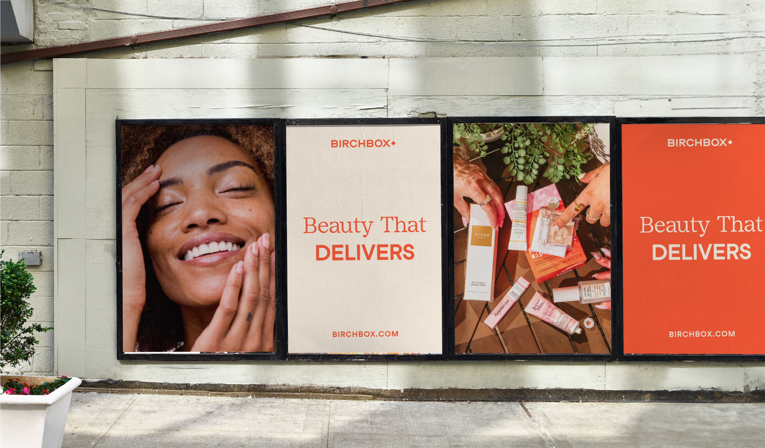
When Retention Brands acquired Birchbox in 2023, I led the effort to rebuild the visual identity once more. Our goal was to recenter the design system around the message of playful discovery and bring back visual elements that deeply resonated with longtime customers.
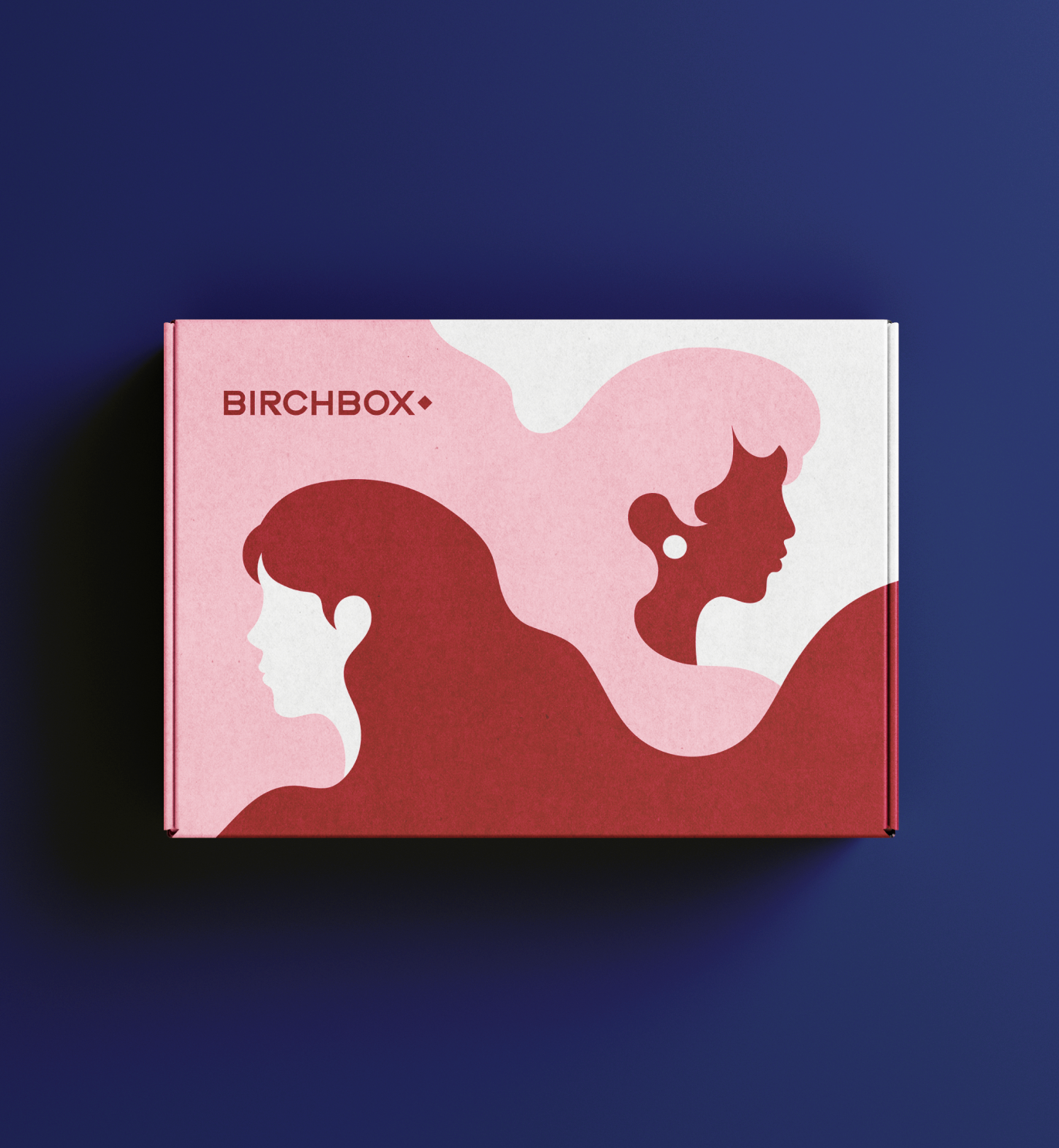
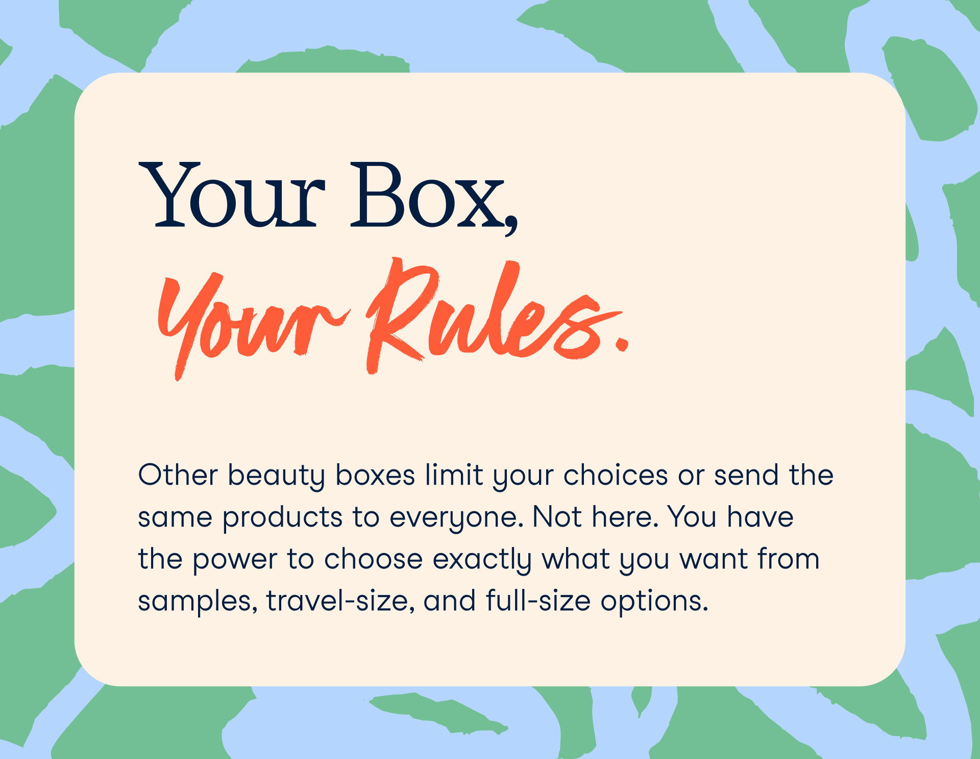
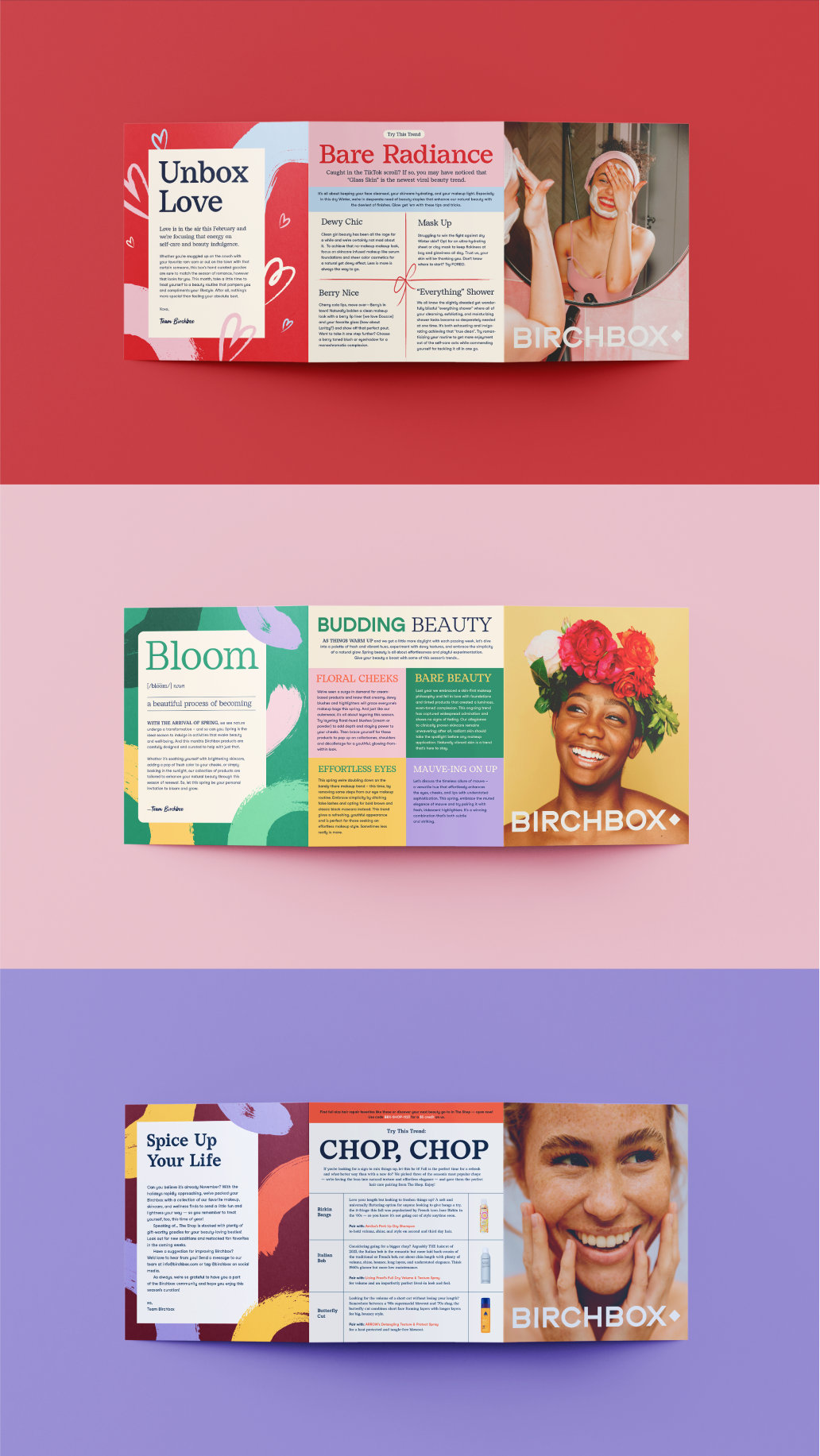
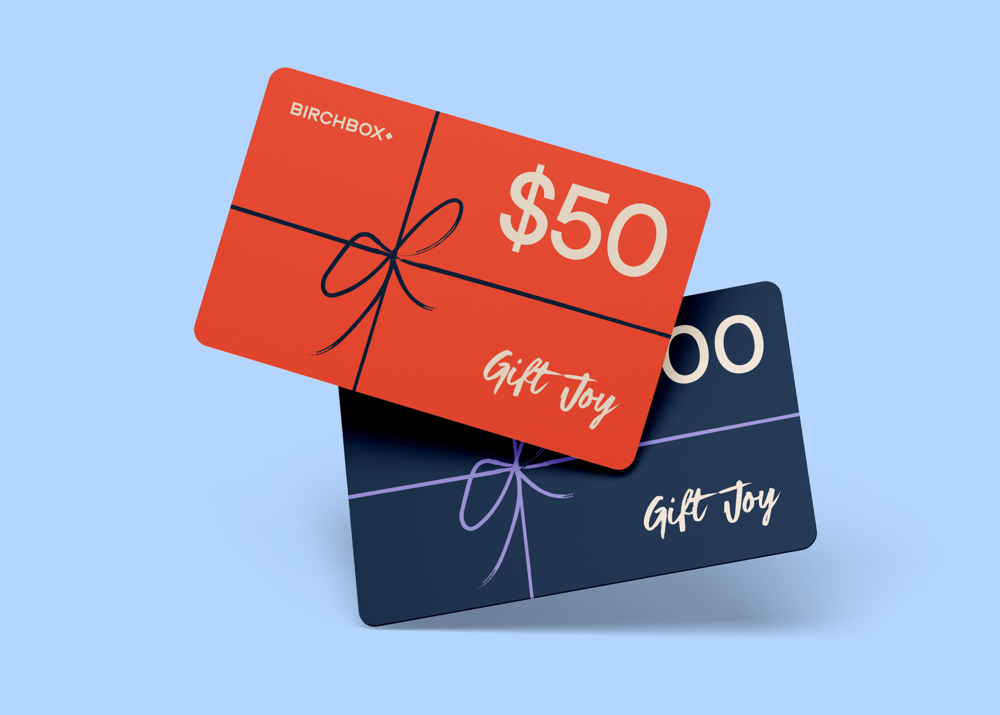
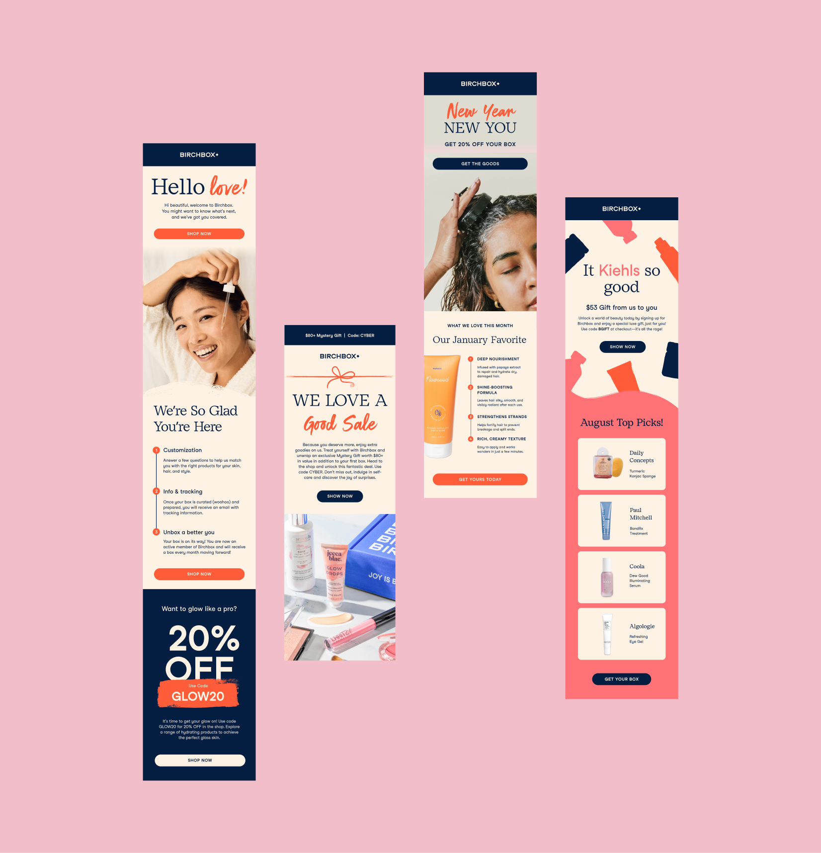
Instead of starting from scratch, we revived the beloved original logo—enhanced with a modern, bolder twist. To restore the familiar “imperfect polish” aesthetic from the original design system, we reintroduced textured brushstrokes and playful illustrations, and paired them with a refined, legible serif font to add a sense of modern elegance.

Color palette
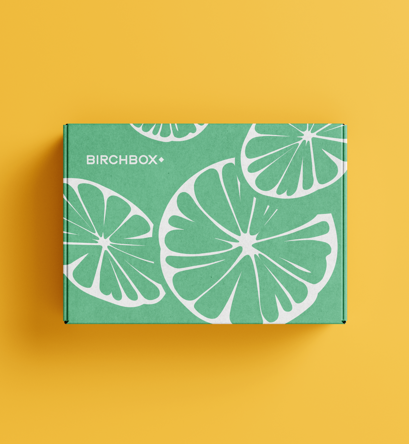
Given the monthly cadence of the subscription model, we also developed a vibrant, flexible color palette designed to adapt to seasonal themes, product rotations—ensuring consistency and freshness across digital and print marketing touchpoints.



Team Credits
Natalie Westerholt
Madison Page
Madison Page