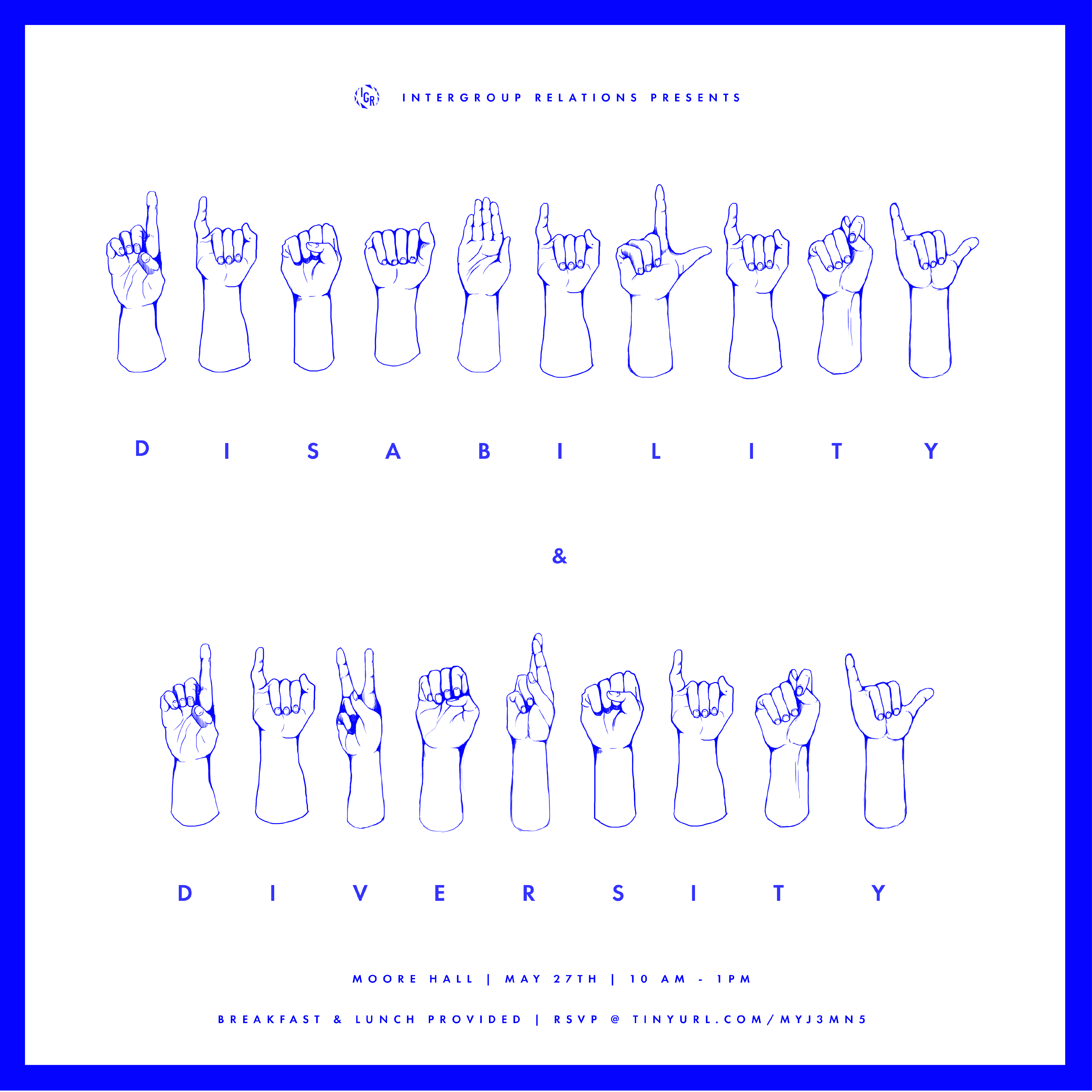
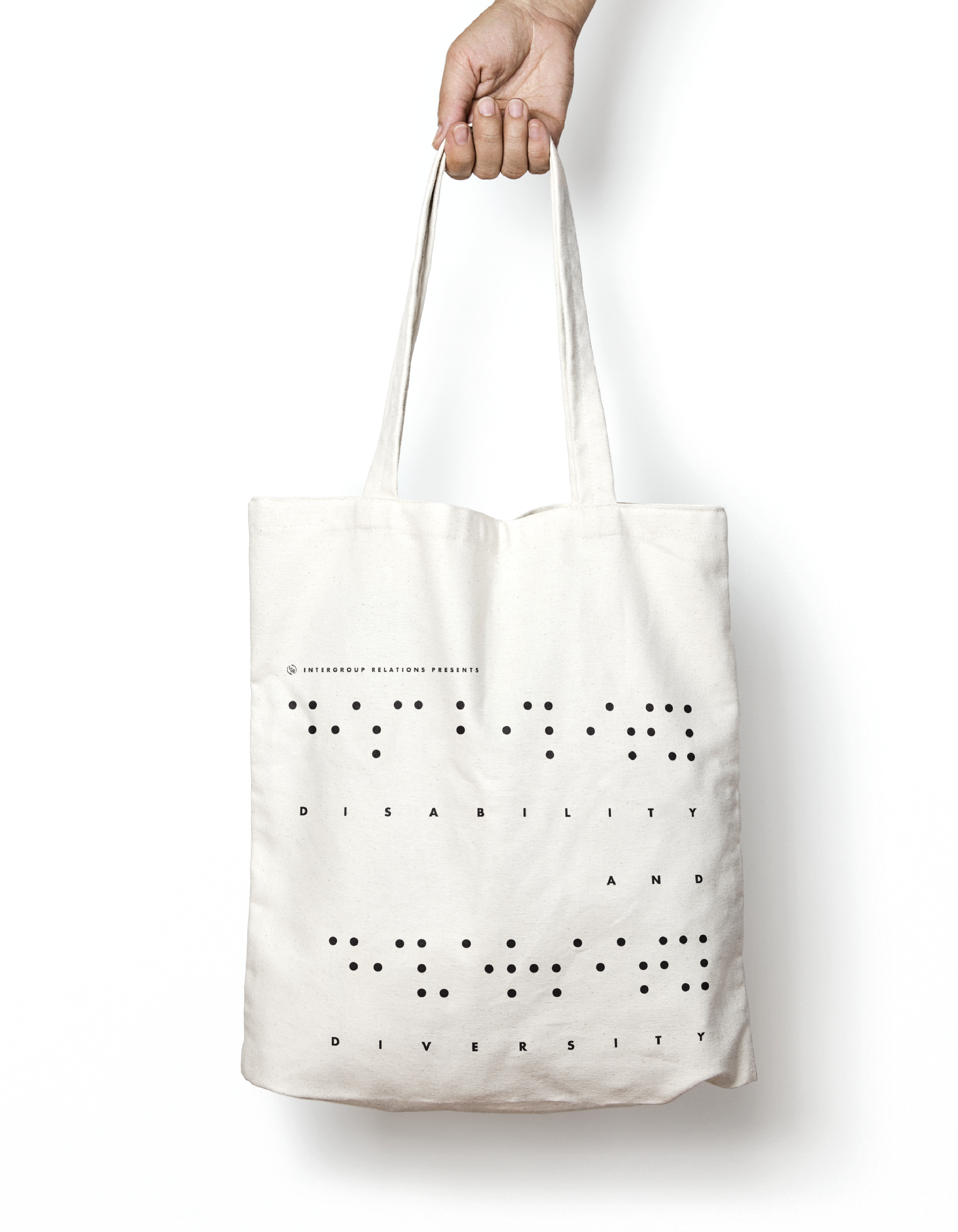
DESIGN PROCESS
For this conference, I wanted to empower the voices of people who are disabled, so I decided to combine sign language and braille code with typography on the event flyer. I kept blue as the main pop of color so that the illustrative elements on the flyer are not overshadowed by other typographic aspects.