Birchbox
Restoring a playful visual identity for a beloved beauty subscription box brand.
2023-2025
Visual identity,
Collateral Design,
Packaging design,
Illustration
Collateral Design,
Packaging design,
Illustration
Context
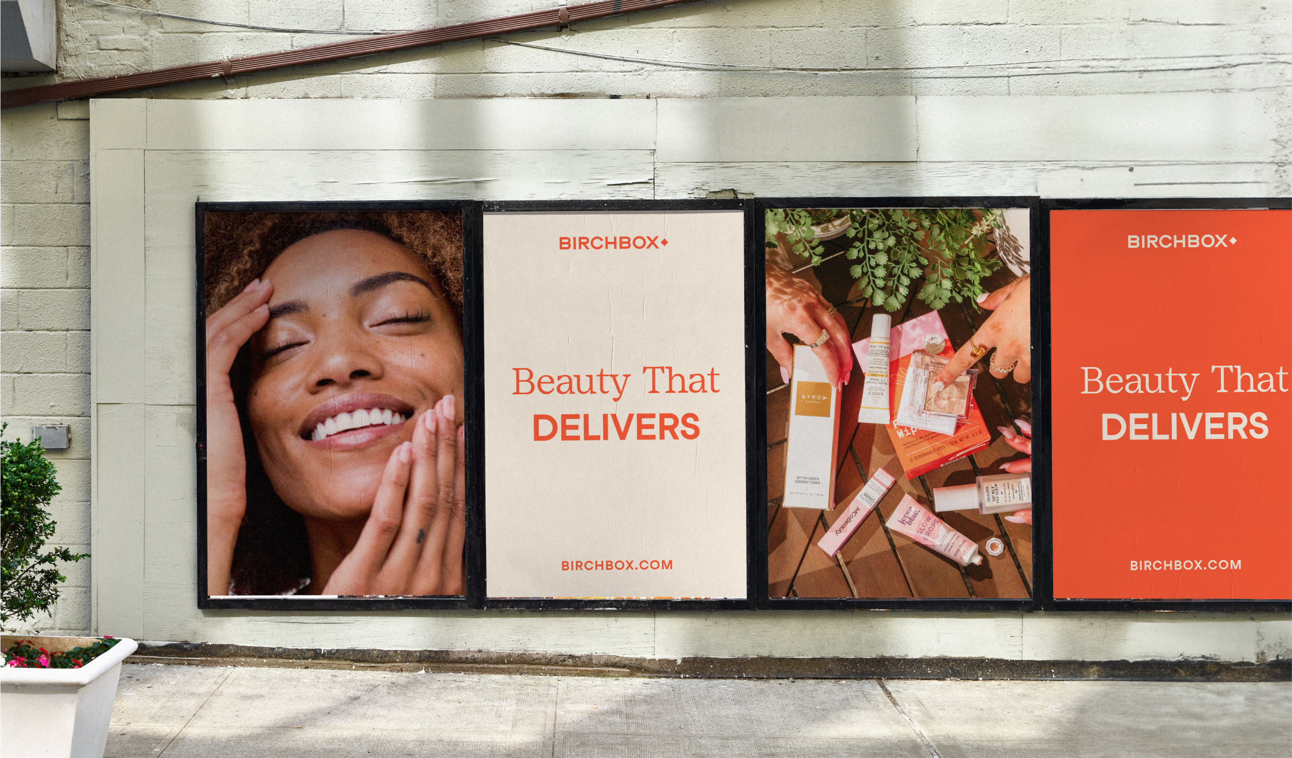
Launched in 2010, Birchbox is a monthly subscription service that delivers personalized beauty products straight to your door. Members gain access to a wide range of brands and the opportunity to discover exclusive products.
Over the years, Birchbox underwent two acquisitions and rebrands—each moving further away from the original visual identity that early fans had loved. The most recent rebrand attempted to target a Gen Z audience with flashy colors and trendy aesthetics, but in doing so, it overlooked Birchbox’s core beauty enthusiasts: Gen X and Millennials, who just wanted an easy, affordable way to discover their next holy grail beauty products.
Strategy & Execution
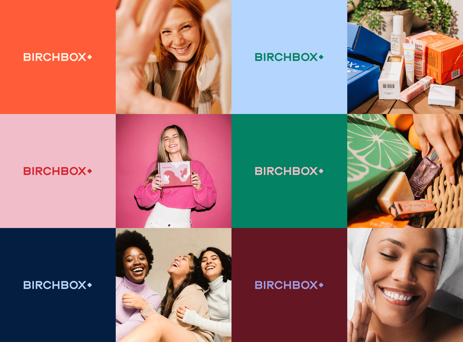
When Retention Brands acquired Birchbox in 2023, I led the effort to rebuild the visual identity once more. Our goal was to recenter the design system around the message of playful discovery and bring back visual elements that deeply resonated with longtime customers.
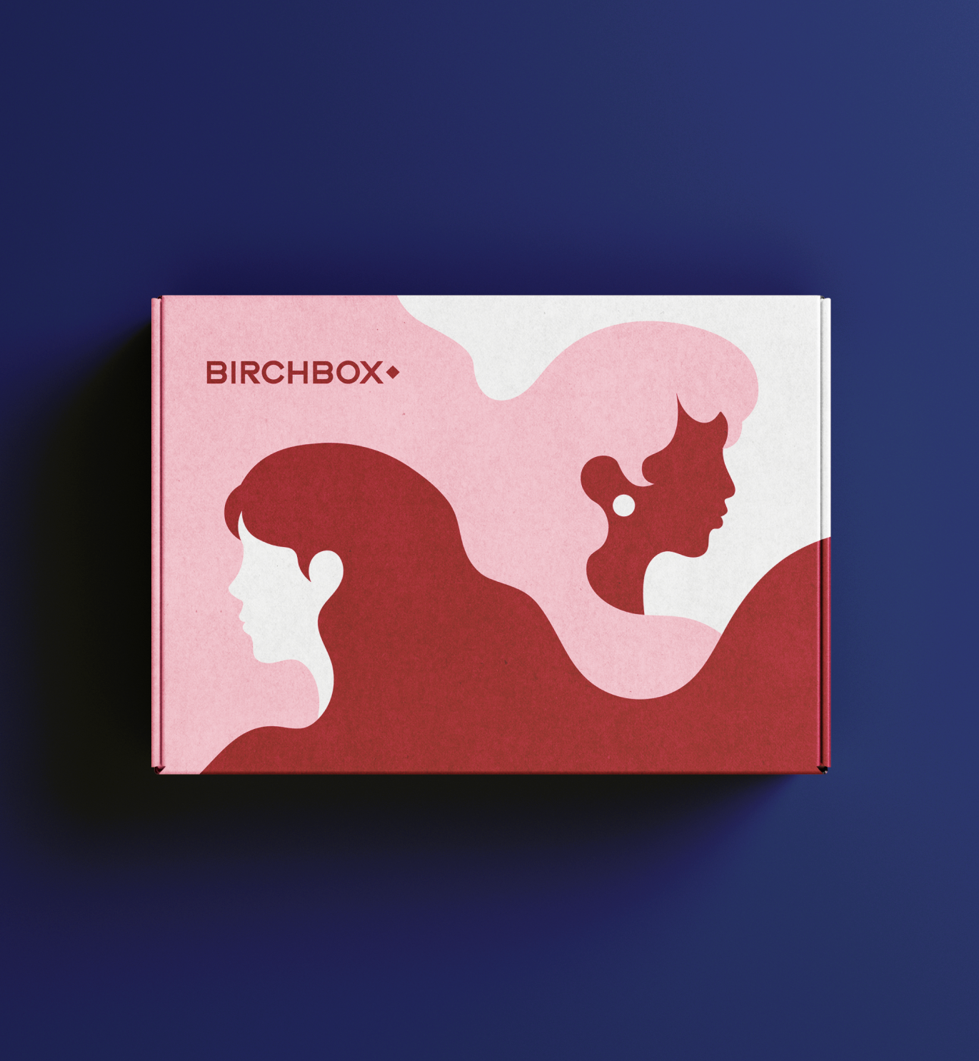
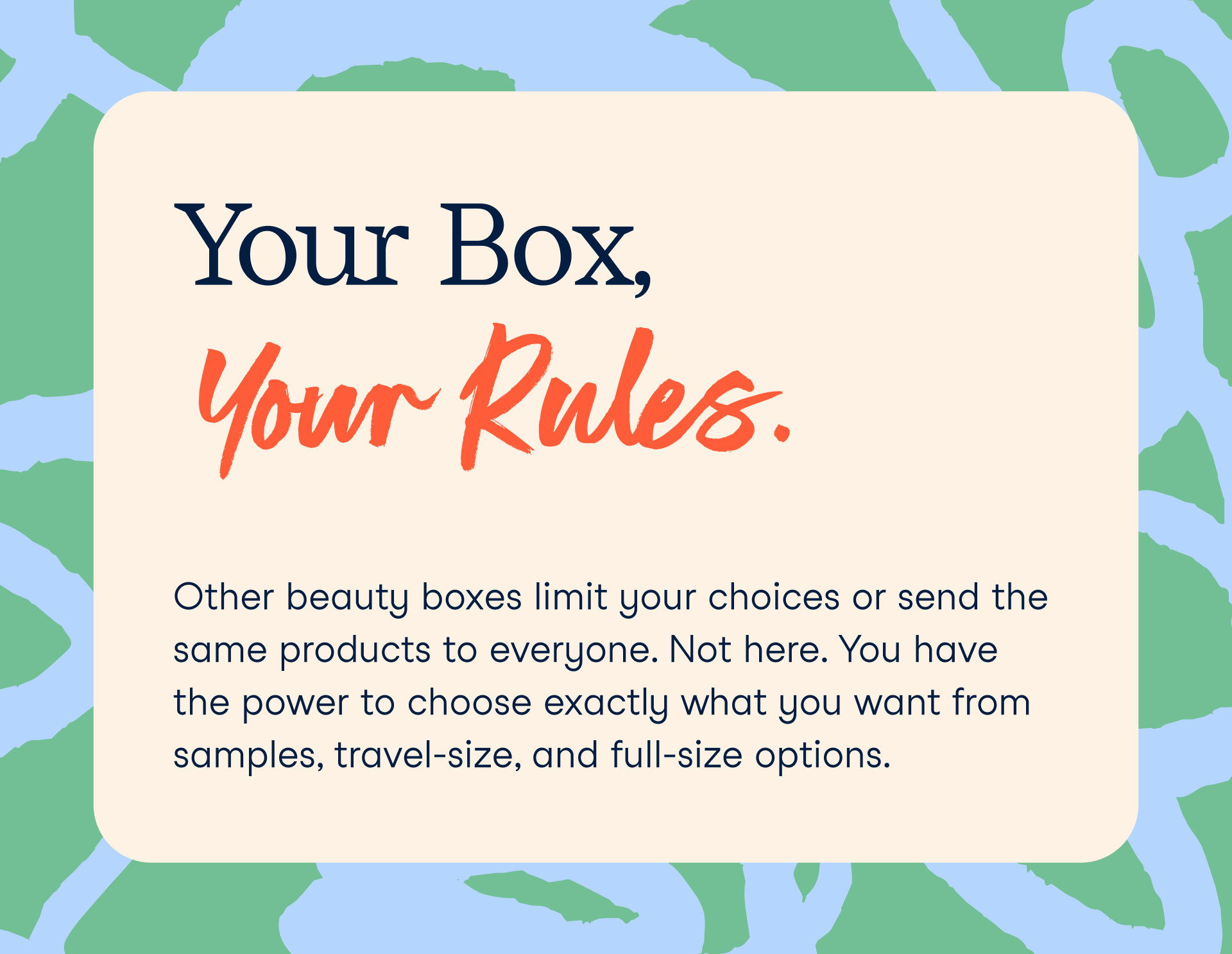
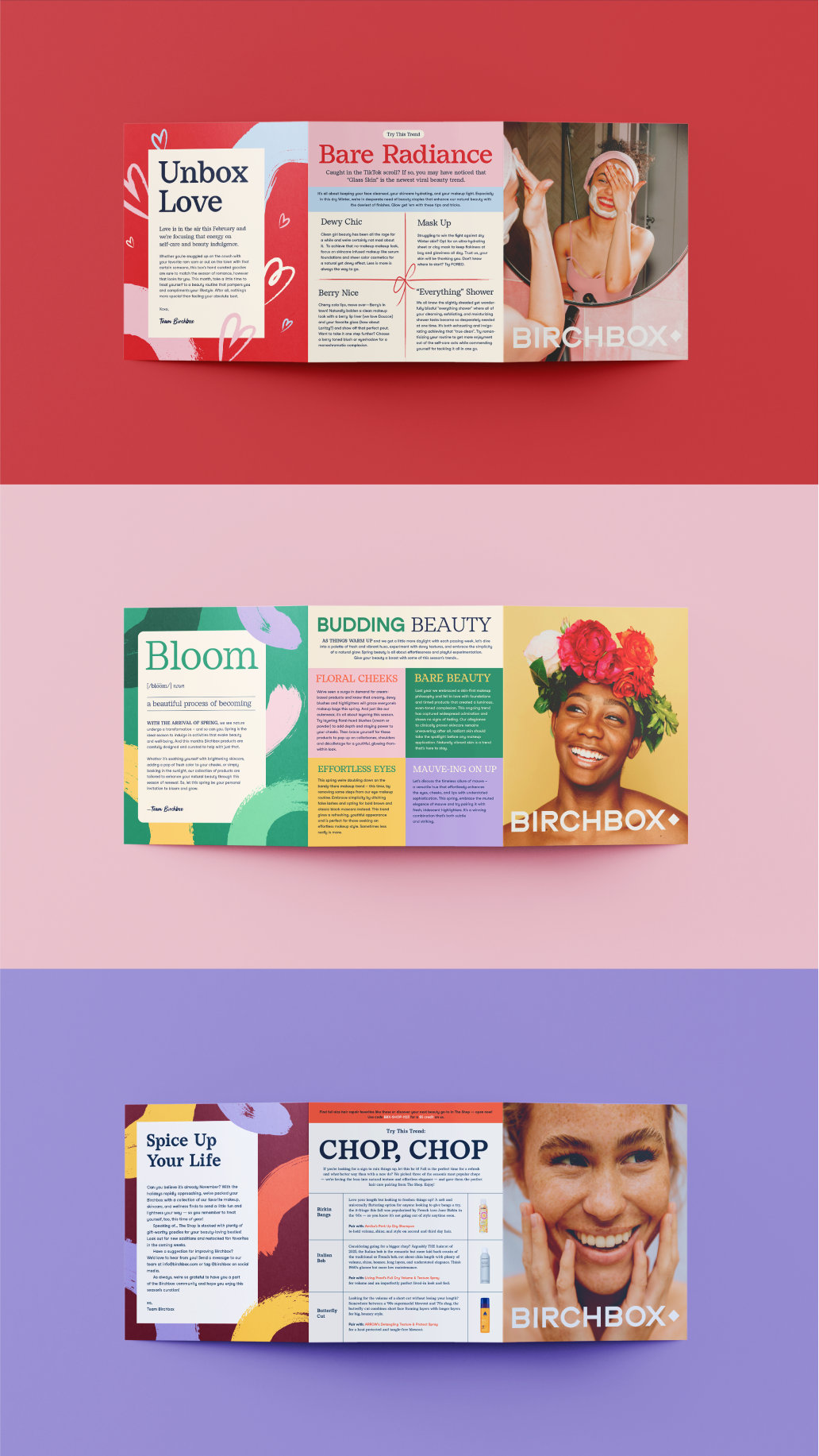
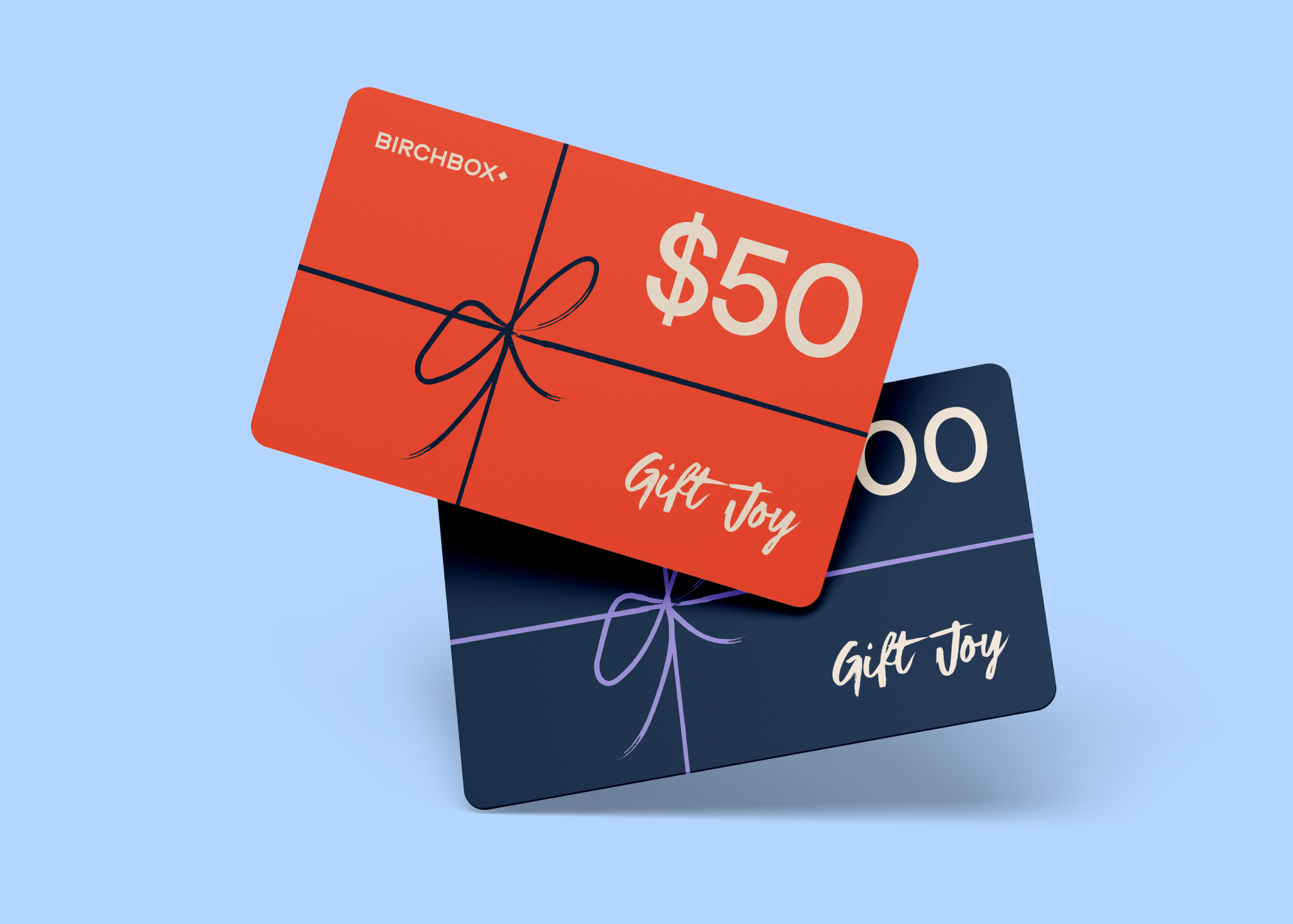
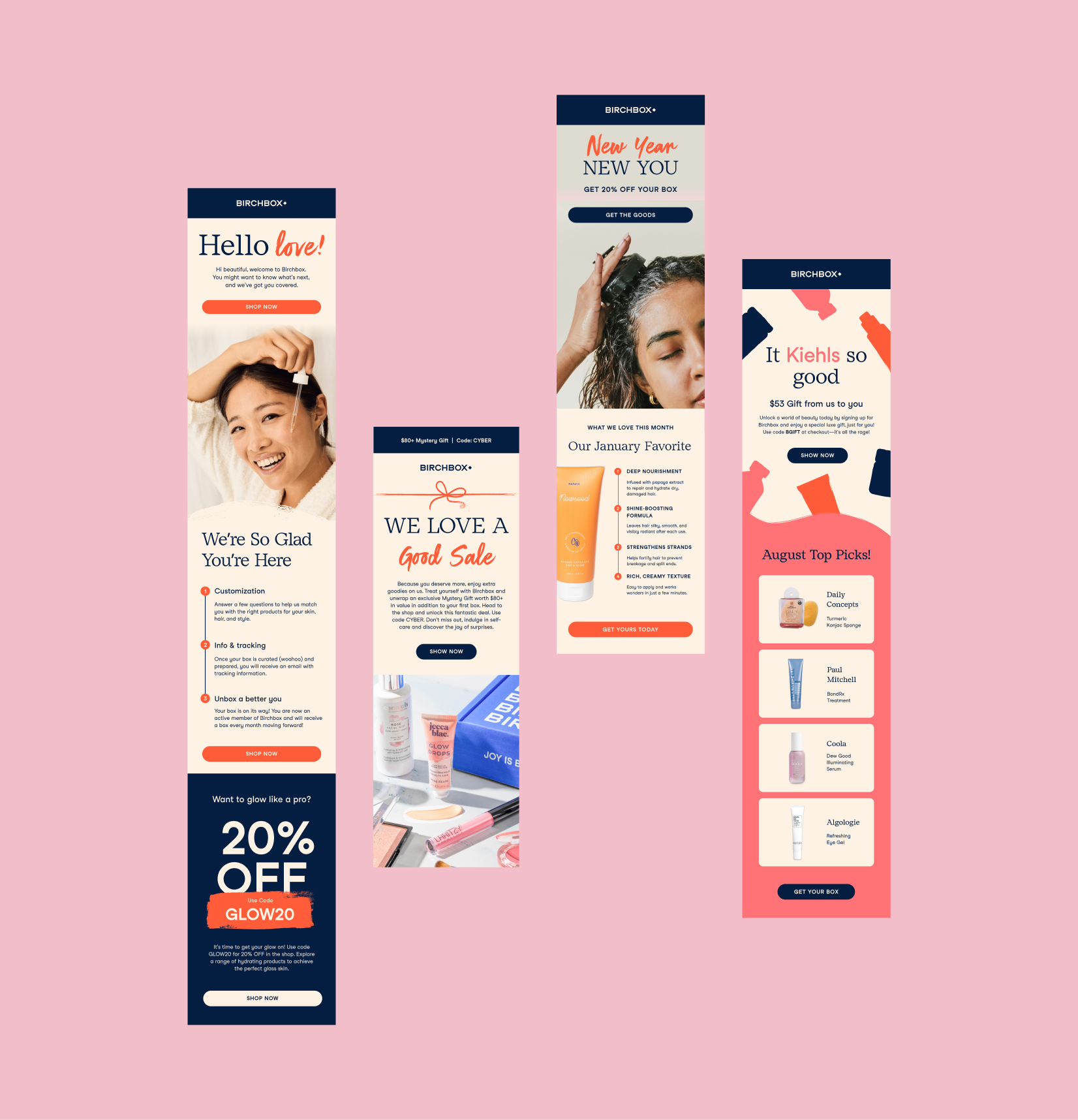
Instead of starting from scratch, we revived the beloved original logo—enhanced with a modern, bolder twist. To restore the familiar “imperfect polish” aesthetic from the original design system, we reintroduced textured brushstrokes and playful illustrations, and paired them with a refined, legible serif font to add a sense of modern elegance.

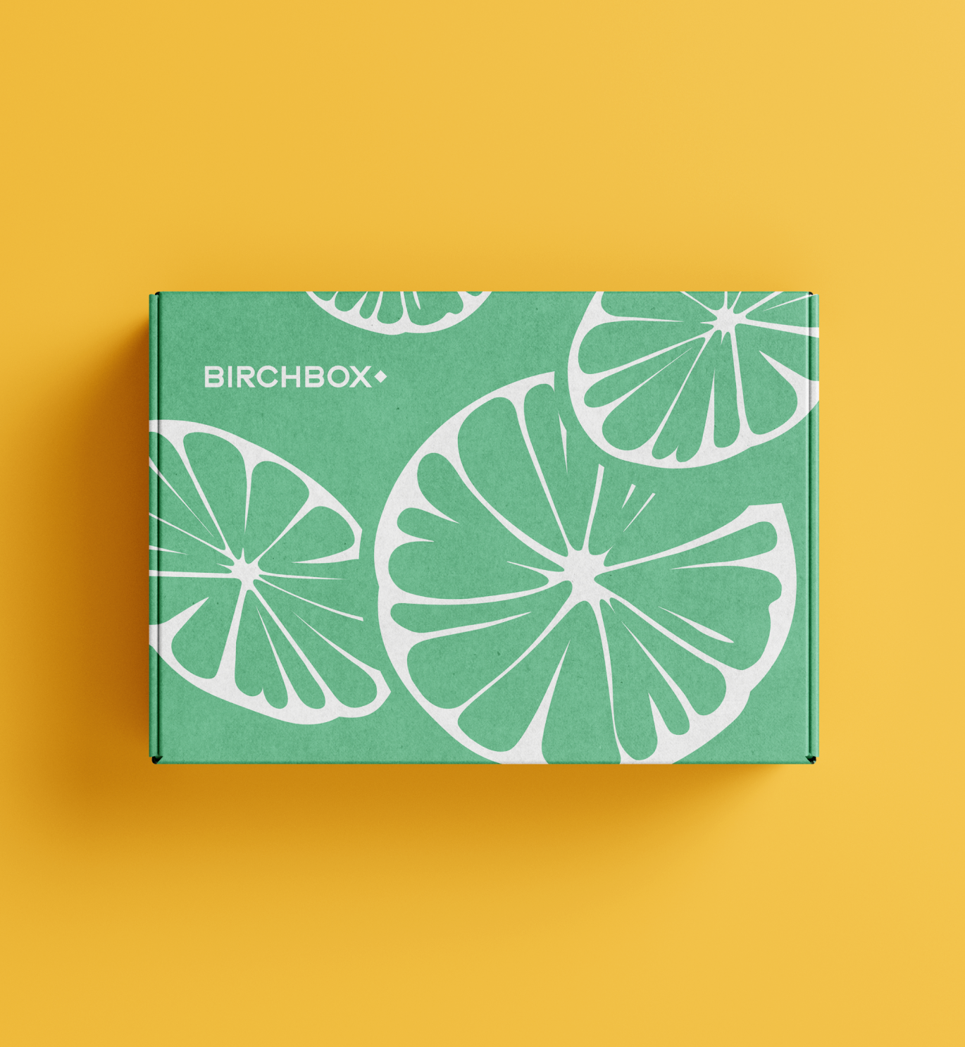
Color palette
Given the monthly cadence of the subscription model, we also developed a vibrant, flexible color palette designed to adapt to seasonal themes, product rotations—ensuring consistency and freshness across digital and print marketing touchpoints.



Team Credits
Natalie Westerholt
Madison Page
Madison Page
Asians@YouTube
An empowering visual identity to celebrate Asian employees at YouTube.
2020
Visual identity,
Collateral Design,
Event Design
Collateral Design,
Event Design

Context
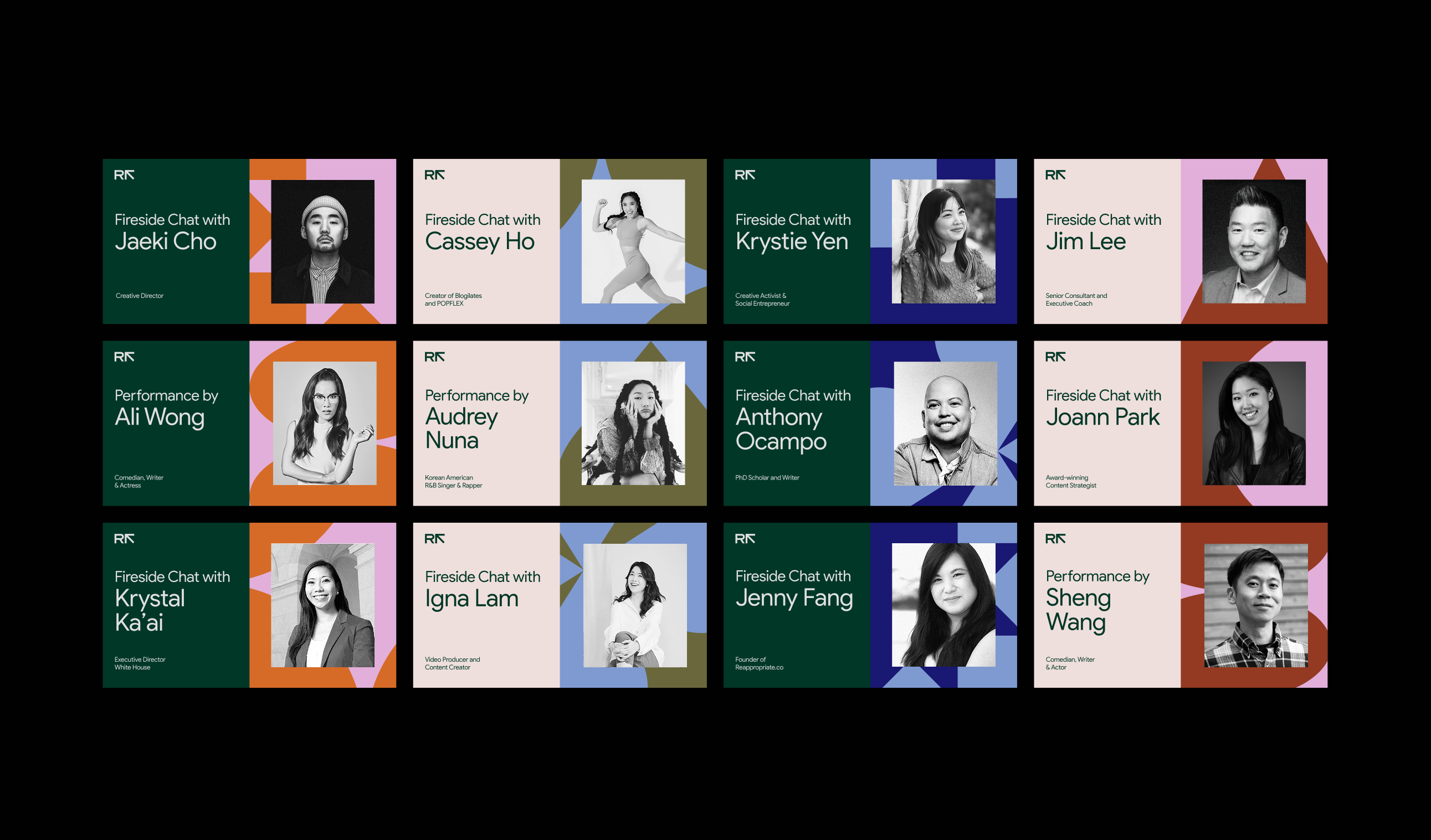
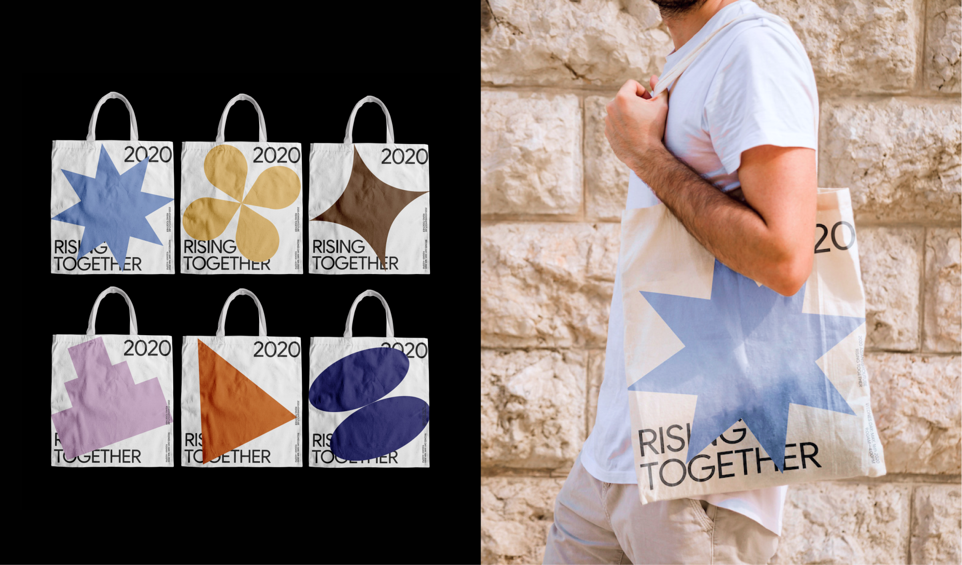
In celebration of Asian American and Pacific Islander Heritage Month, YouTube hosts an annual conference for Asian employees to gather, celebrate, and recognize the community’s incredible talent. In 2020, the event centered around the theme Rising Together—a call to empower and uplift the Asian community through shared challenges, creativity, and collective strength. The conference featured inspiring talks, performances, and workshops led by notable figures across the industry, from content creators and business owners to musicians and comedians.


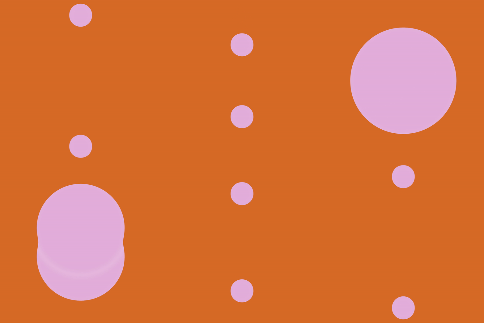


Shapes + Color Palette
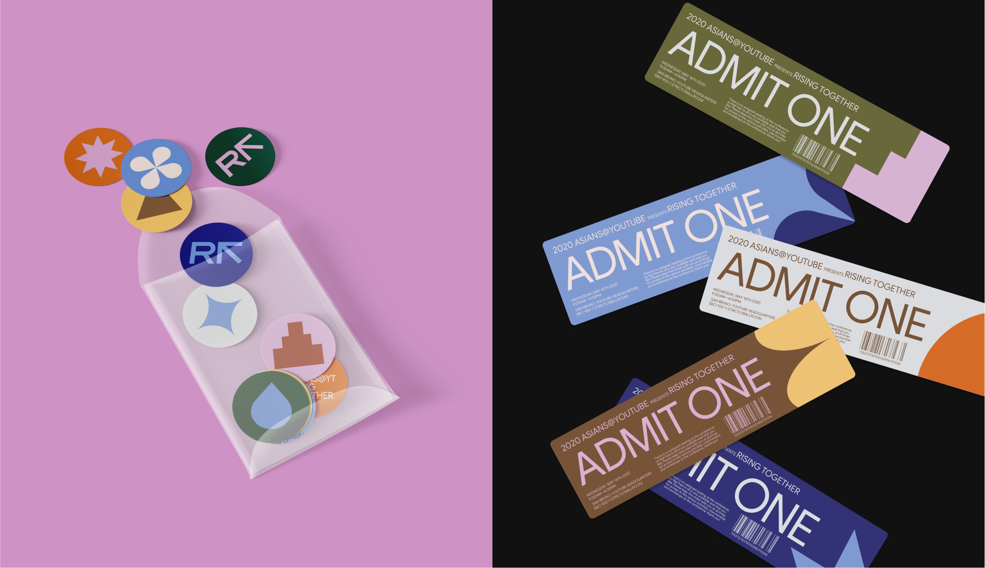
The final visual system embraces simplicity and flexibility, built from geometric forms that capture the essence of community—solidarity, bonds, passion, love, empathy, empowerment, hope, and support. Each shape functions as a visual metaphor, transforming intangible values into a shared visual language.
The exploration began with curated imagery capturing the emotional and symbolic spirit of these values—from the gentle nature of empathy to the radiant energy of hope. These references informed the geometric compositions, allowing abstract characteristics to take on structure and form. Once the geometric shapes were established, we selected colors that are harmonious yet contrasting, creating a sense of both diversity and unity.The resulting identity harmonizes seamlessly with the typeface Google Sans, creating a system that is both vibrant and adaptable—one that scales across print and digital expressions.
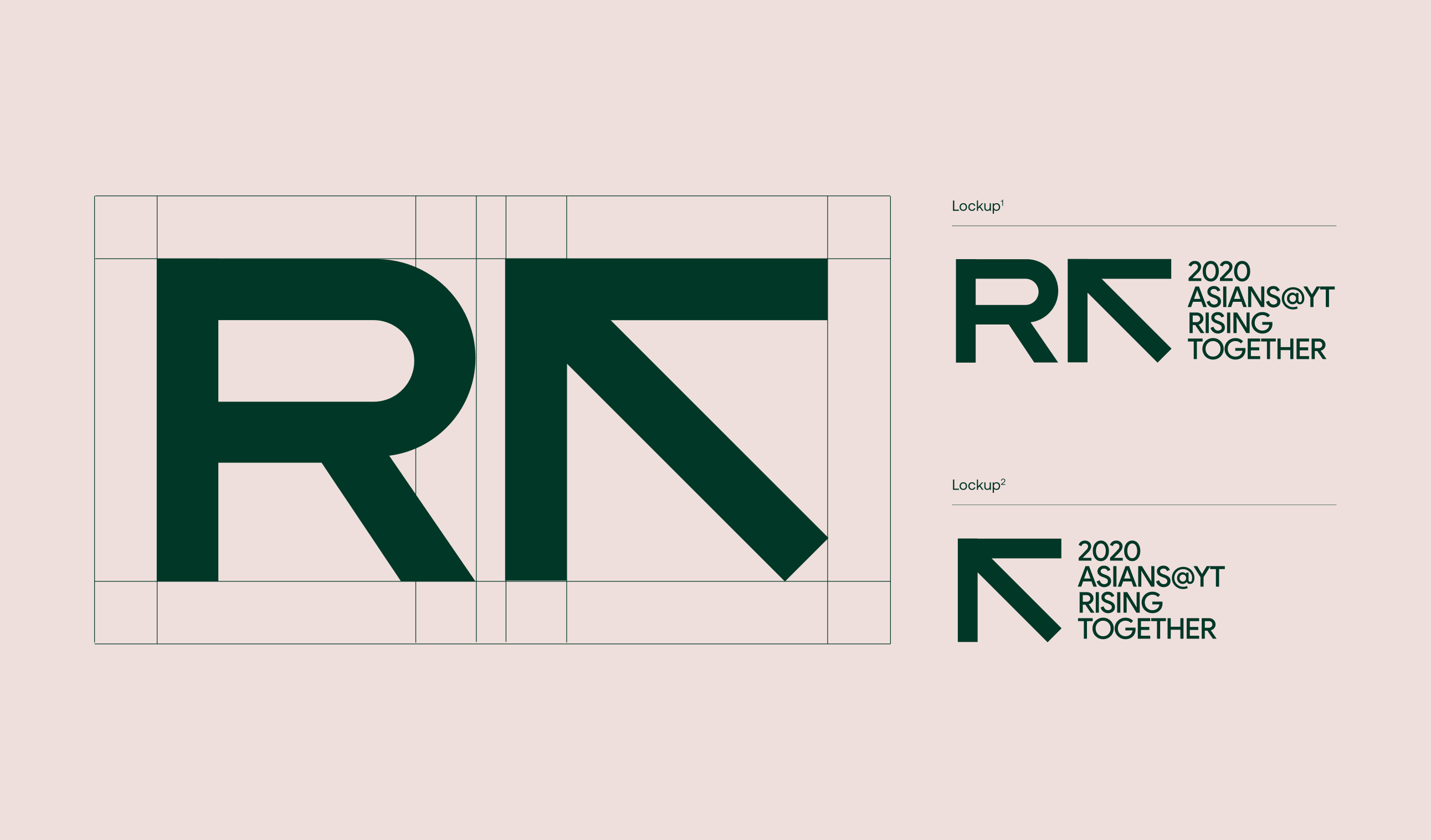
Logo Mark
The logo mark combines the letter “R”—representing Rising Together—with an arrow form that conveys upward movement and forward momentum. The integration of these two elements creates a unified symbol of growth, progress, and collective strength. Two lockup variations are shown to demonstrate flexibility across different layouts and applications.



Universe
Brand identity, website templates and social media content for a next-gen mobile web design platform.
2022-2023
Brand Identity,
Social Media Design,
Illustration,
Storyboarding,
Art Direction
Social Media Design,
Illustration,
Storyboarding,
Art Direction
Context
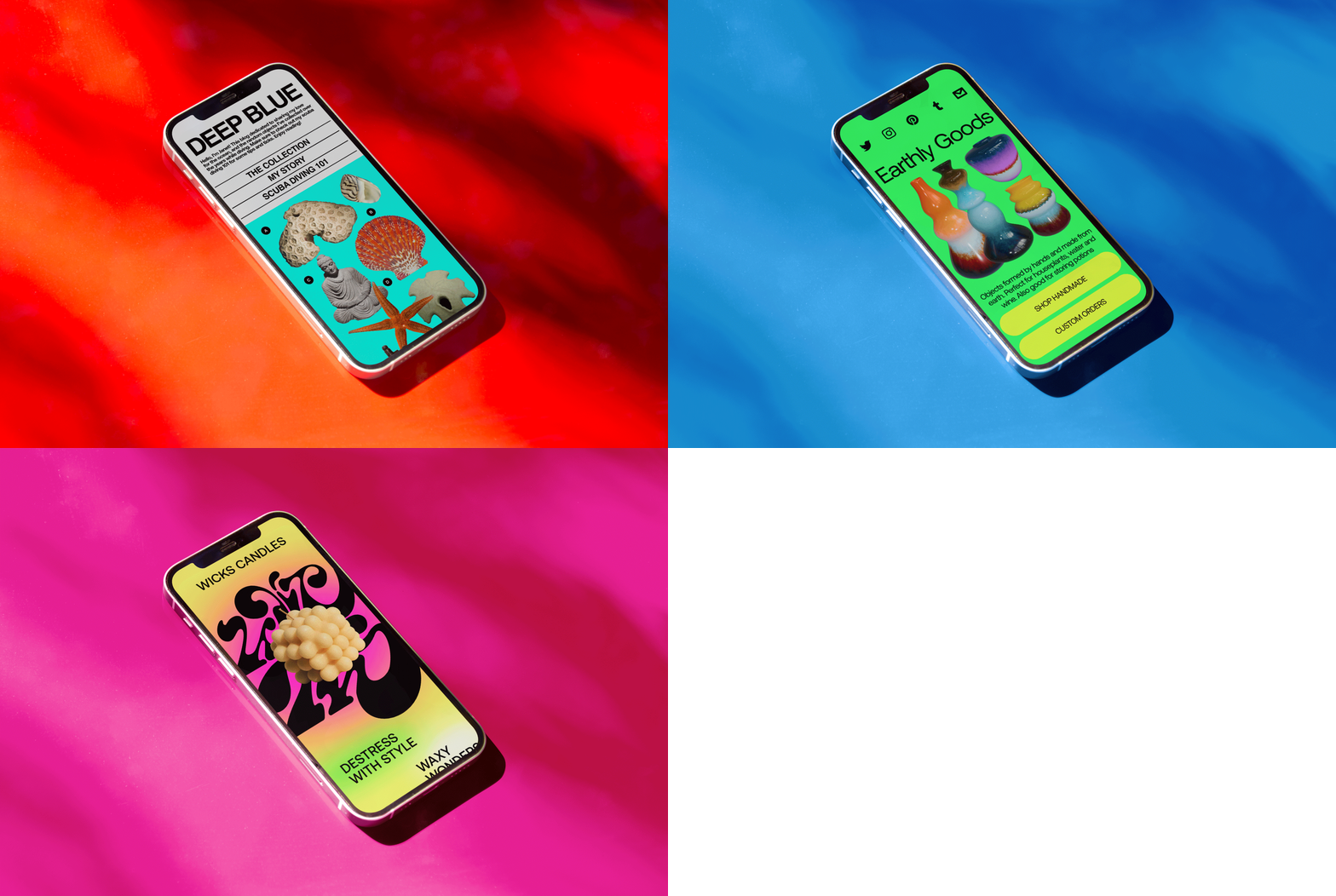
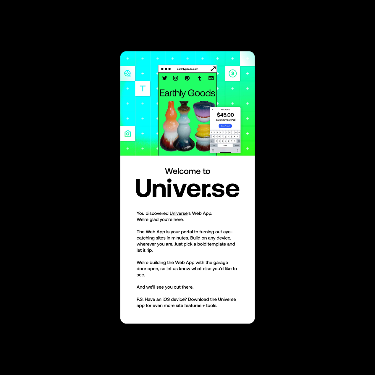
Universe is a mobile first website building platform that allows anyone to create your dream site within seconds. The app’s drag and drop technology and grid system makes it easy to construct and rearrange elements on a site—no code needed.
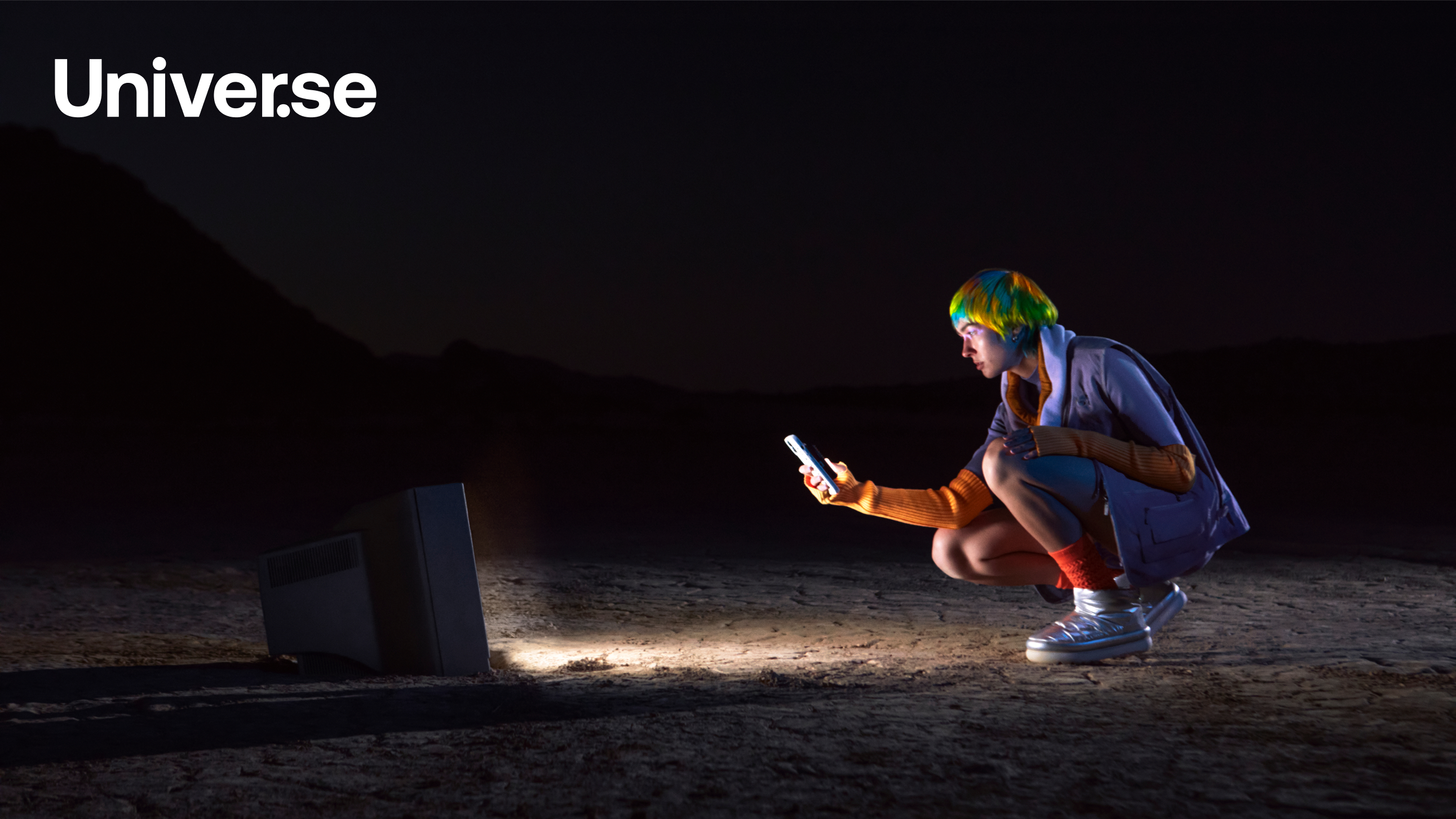
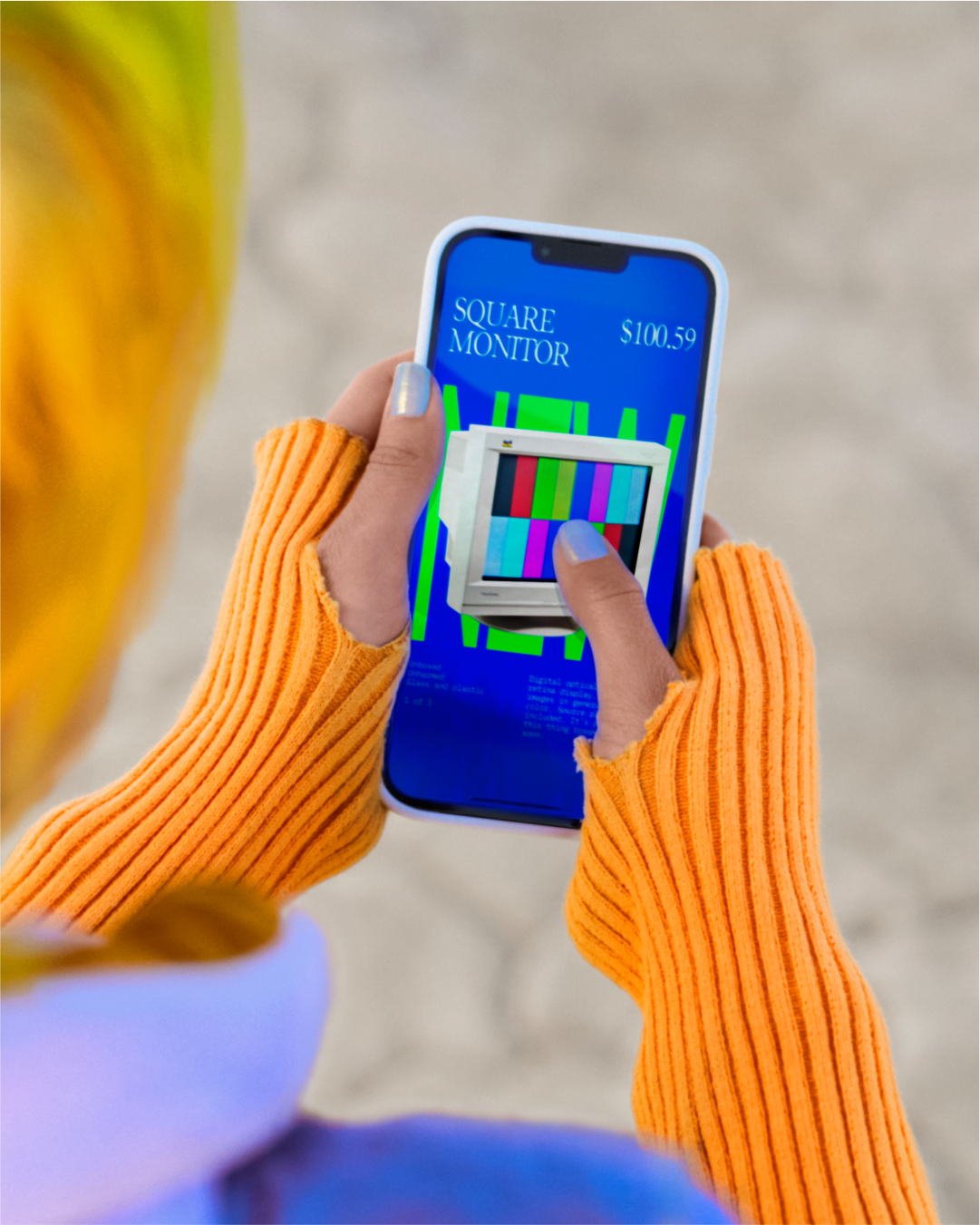
As a brand designer, I focused on developing and applying Universe’s brand aesthetic “techno punk”—a playful, DIY, electrified punk aesthetic—across a plethora of marking touchpoints including: branded email illustrations, website templates, and social media content.


Brand Campaign
Hello World
(Brand)
(Brand)
In an effort to boost brand awareness and drive customer acquisition, the company launched a video titled “Hello, World.” The campaign aimed to showcase the app’s capabilities and inspire creators to test out the product.
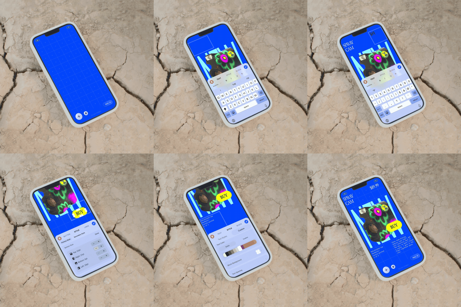
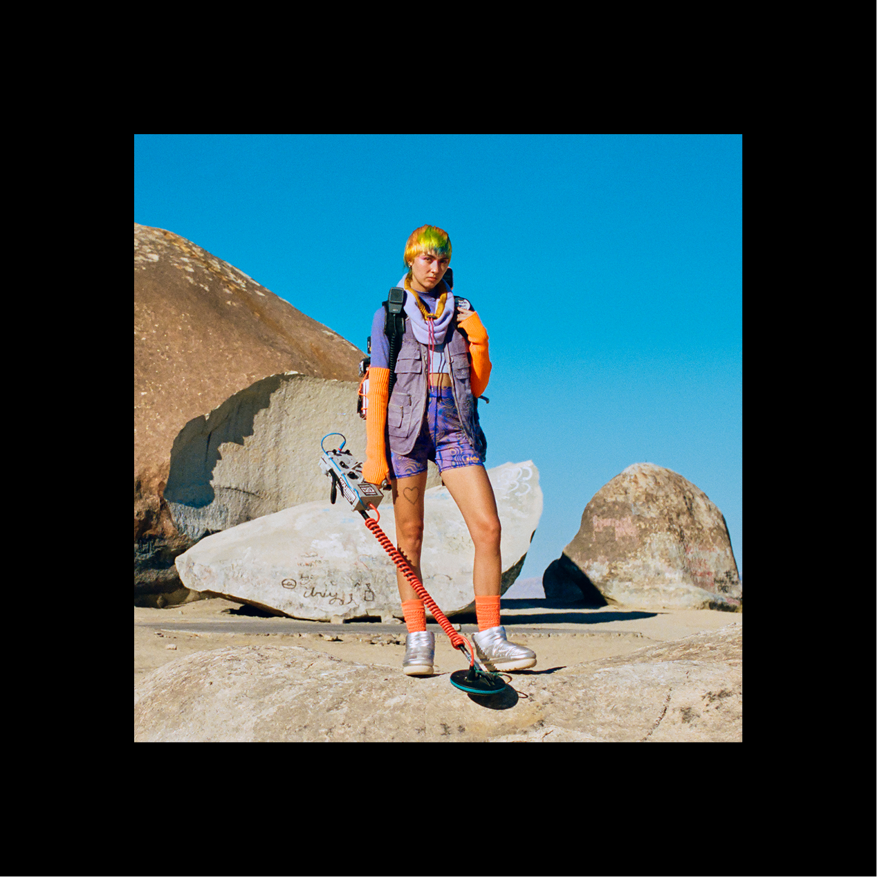
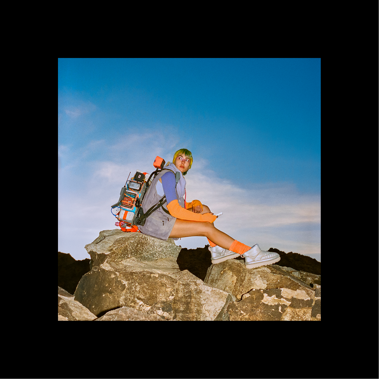
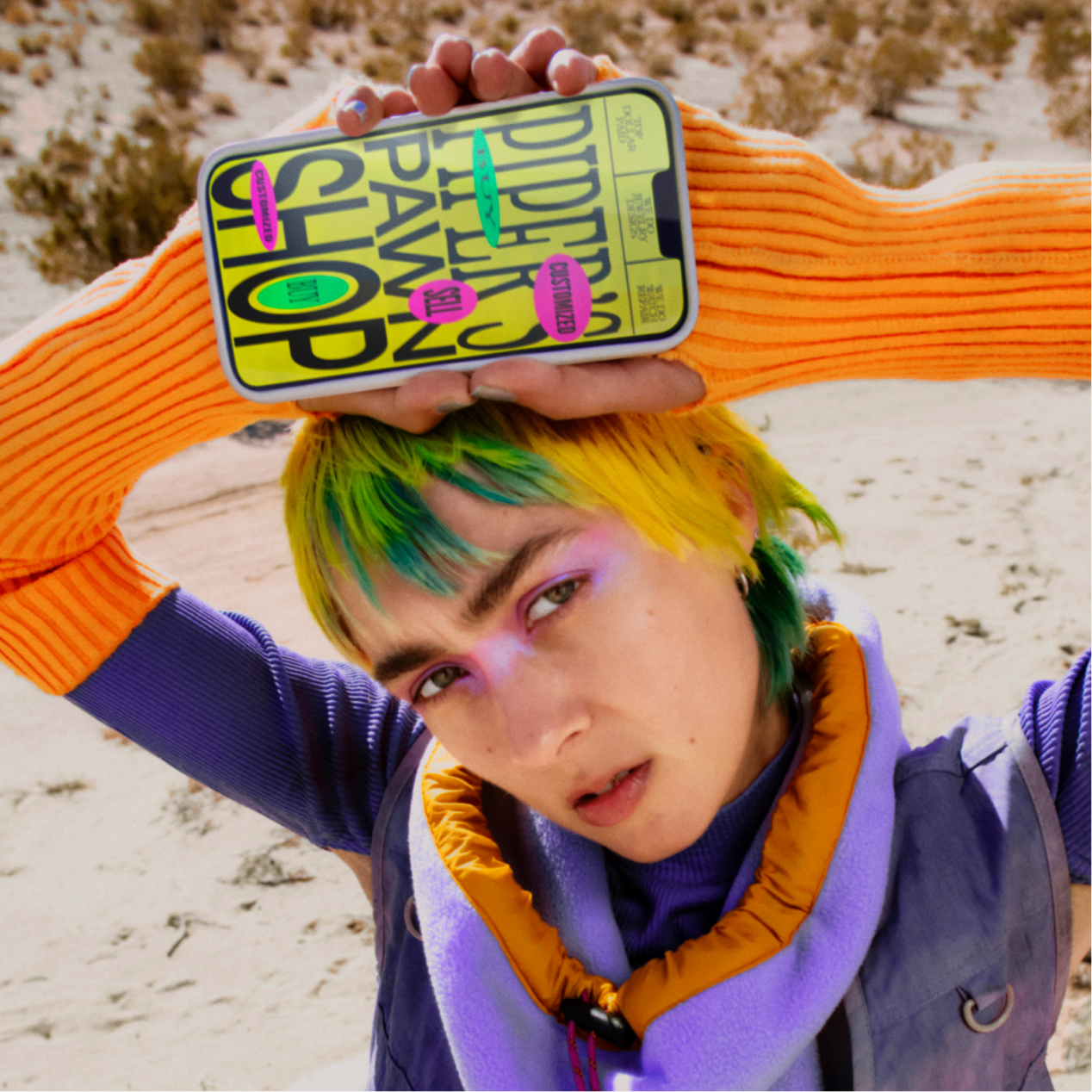
The story in the video follows a nomadic creator named Piper, who travels the world collecting rare and curious items to sell in her pawn shop. One day, she stumbles upon Universe—and upon discovering how easy it is to build her own website, she creates “Piper’s Pawn Shop.”
Working closely with the Creative Director, I led the design and direction of the visual identity for Piper’s website. From developing initial mood boards to laying out the site structure, I ensured the aesthetic felt uniquely Piper. The final design not only captures her quirky personality but also reflects the playful and electric spirit of the brand itself.

Product Launch Campaigns
Text Spacing
(Product Feature)
(Product Feature)
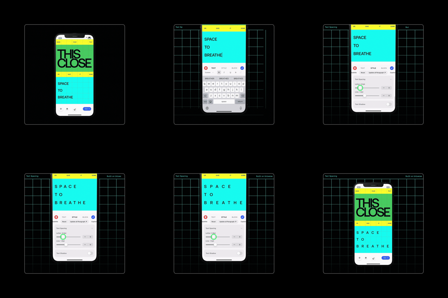
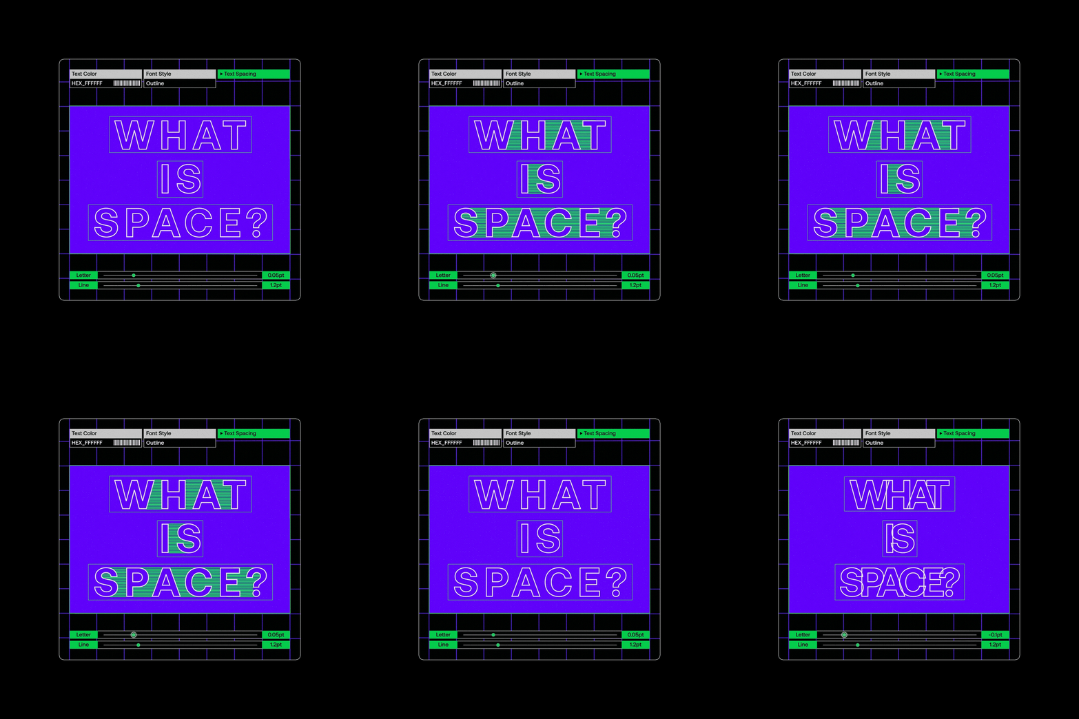
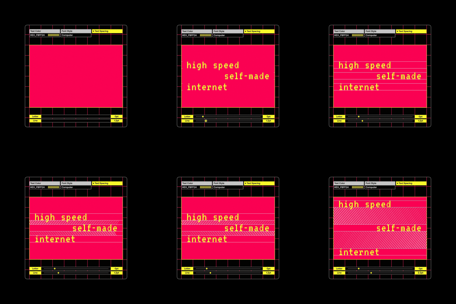
When Universe launched its new text spacing feature, I directed a series of animations to showcase the endless possibilities it unlocked. With a technological, electrified brand aesthetic, the animations were designed to both inform and excite current Universe users. Each piece focused on demonstrating the creative range of the new tools—highlighting variations in letter spacing and line spacing to inspire playful experimentation.

Domain+
(Subscription Plan)
(Subscription Plan)
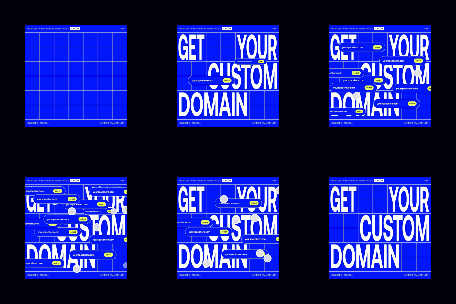
To drive growth in active app subscriptions, Universe launched Domain+, an affordable plan offering users a custom domain for under $1 per month. I directed and storyboarded the campaign video to convey the urgency of claiming a unique domain before it’s gone. Inspired by the chaotic energy of ’90s pop-up ads, I used overlapping layers, repetition, and motion to evoke the fast-paced rush of securing your domain before someone else does. In addition to the video, I also designed email and in-app assets for this new subscription plan.


Social Media
Creator Website Spotlights
Creator Interviews
Template Tutorials
Creator Interviews
Template Tutorials
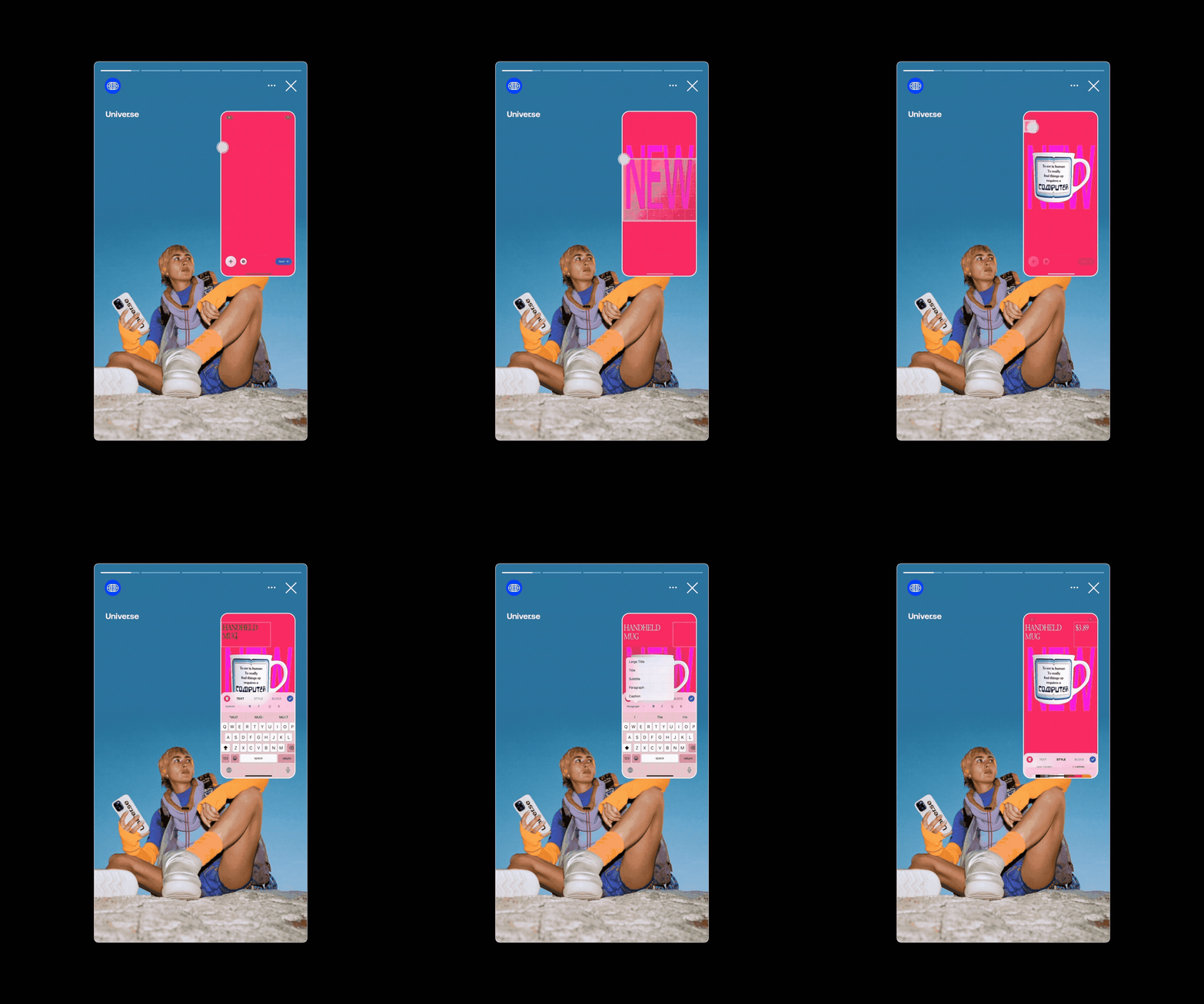
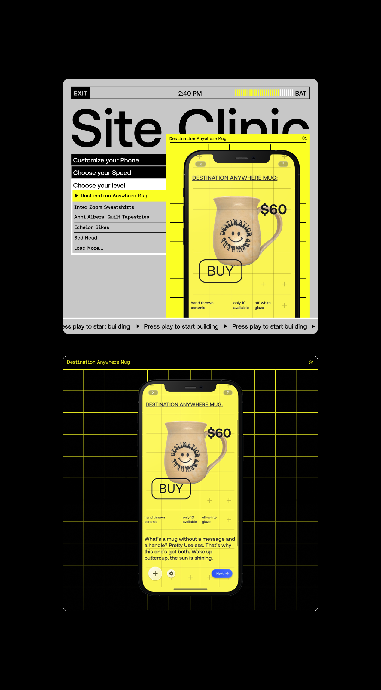
Another key marketing goal was to increase subscriber growth across social media platforms. To support this, I collaborated with the marketing team to create inspiring content that showcased Universe’s tools and spotlighted real creators and their websites.

Marissa de Miguel
A confident visual identity for a brand strategy studio that empowers businesses towards growth.
2024
Visual Identity,
Website Design
Website Design

Context
Marissa de Miguel is a brand strategy studio operating at the intersection of consultancy and creativity. Looking to expand her reach, the founder, Marissa approached me for a bold and minimalist visual identity that would reflect her personality and showcase her superpower as a strategic creative.

Process & Execution
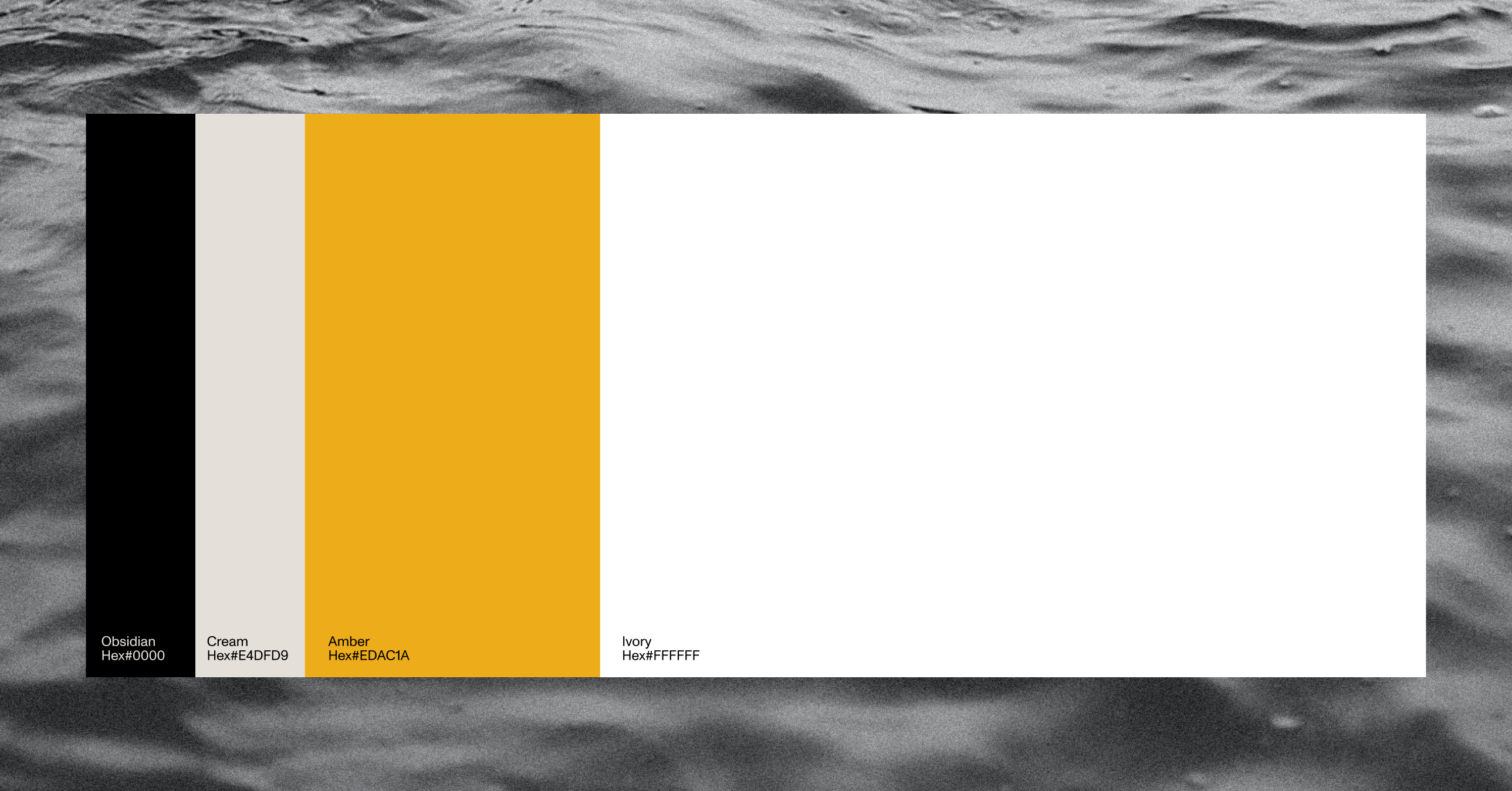
Together, we created a striking yet simple color palette that balances minimalist sensibilities — anchored in neutral, black and white tones — with bold expression through a vibrant yellow accent. This pop of color injects personality and energy into the system, serving as a visual reflection of Marissa’s confident nature. To complement this palette, we selected a condensed serif typeface alongside a sharp, clean sans-serif. The pairing introduces both elegance and edge, lending sophistication and distinct character to the brand’s voice.
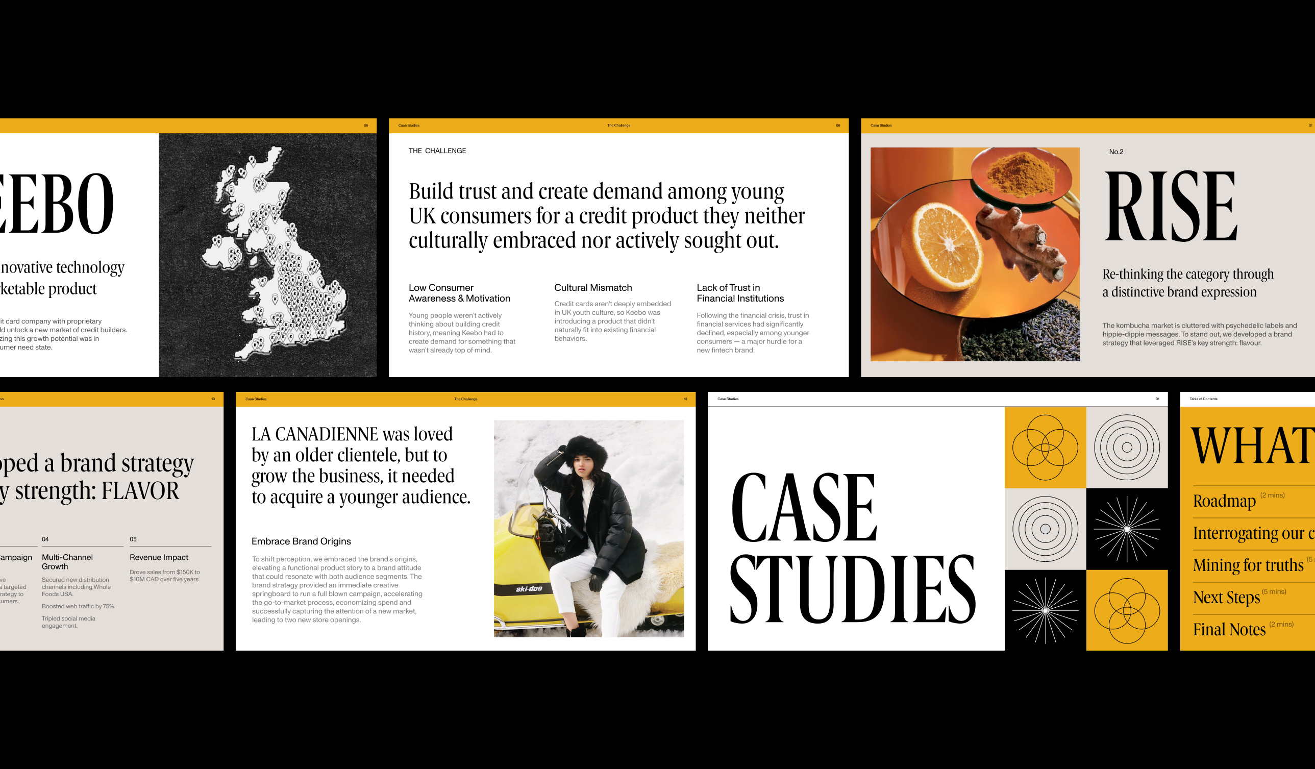
Color palette
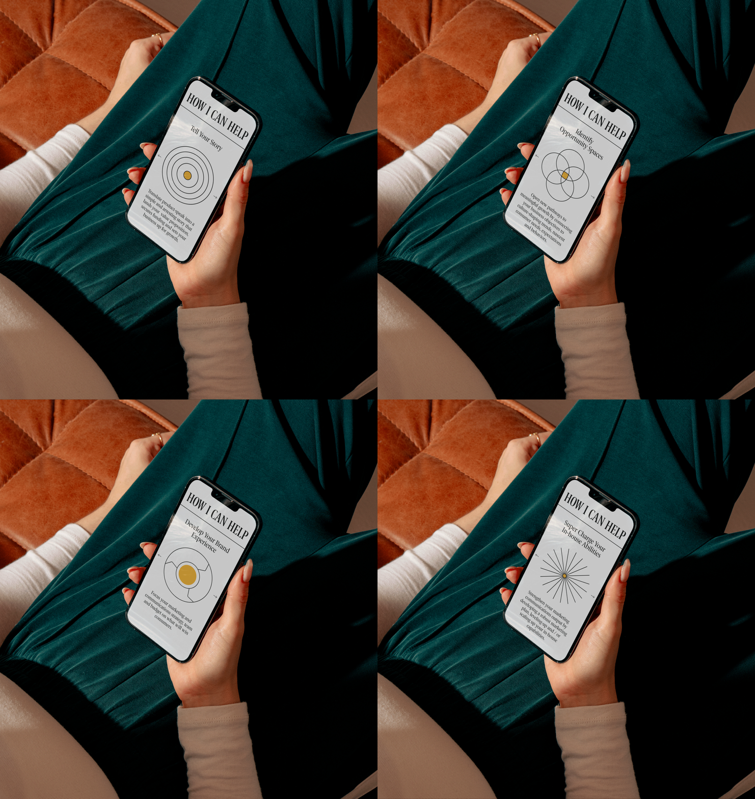
Finally, we designed a set of custom icons to visually communicate Marissa’s services in an engaging and elegant way for her website.


Alltrue
Evolving a brand identity for a subscription company that is commited to delightful and sustainable goods.
2021—2022
Brand Identity,
Website Design,
Social Media Design,
Magazine Design,
Email Design
Website Design,
Social Media Design,
Magazine Design,
Email Design

Context
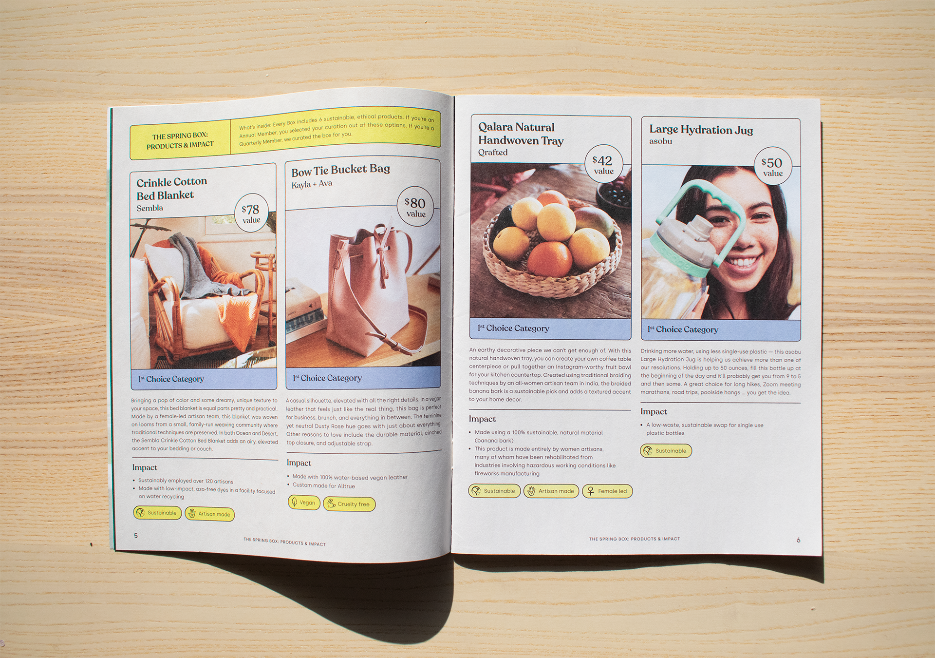
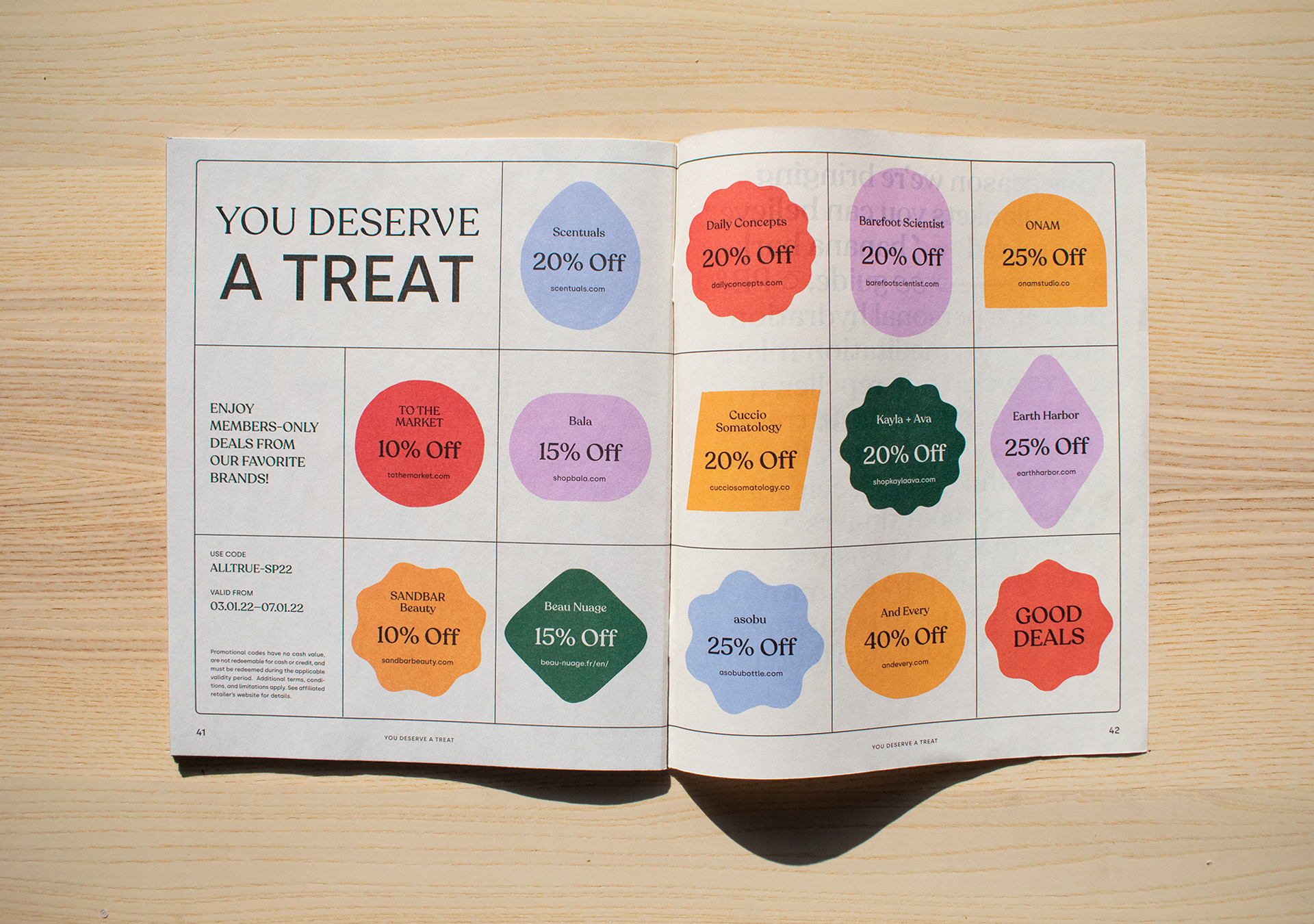
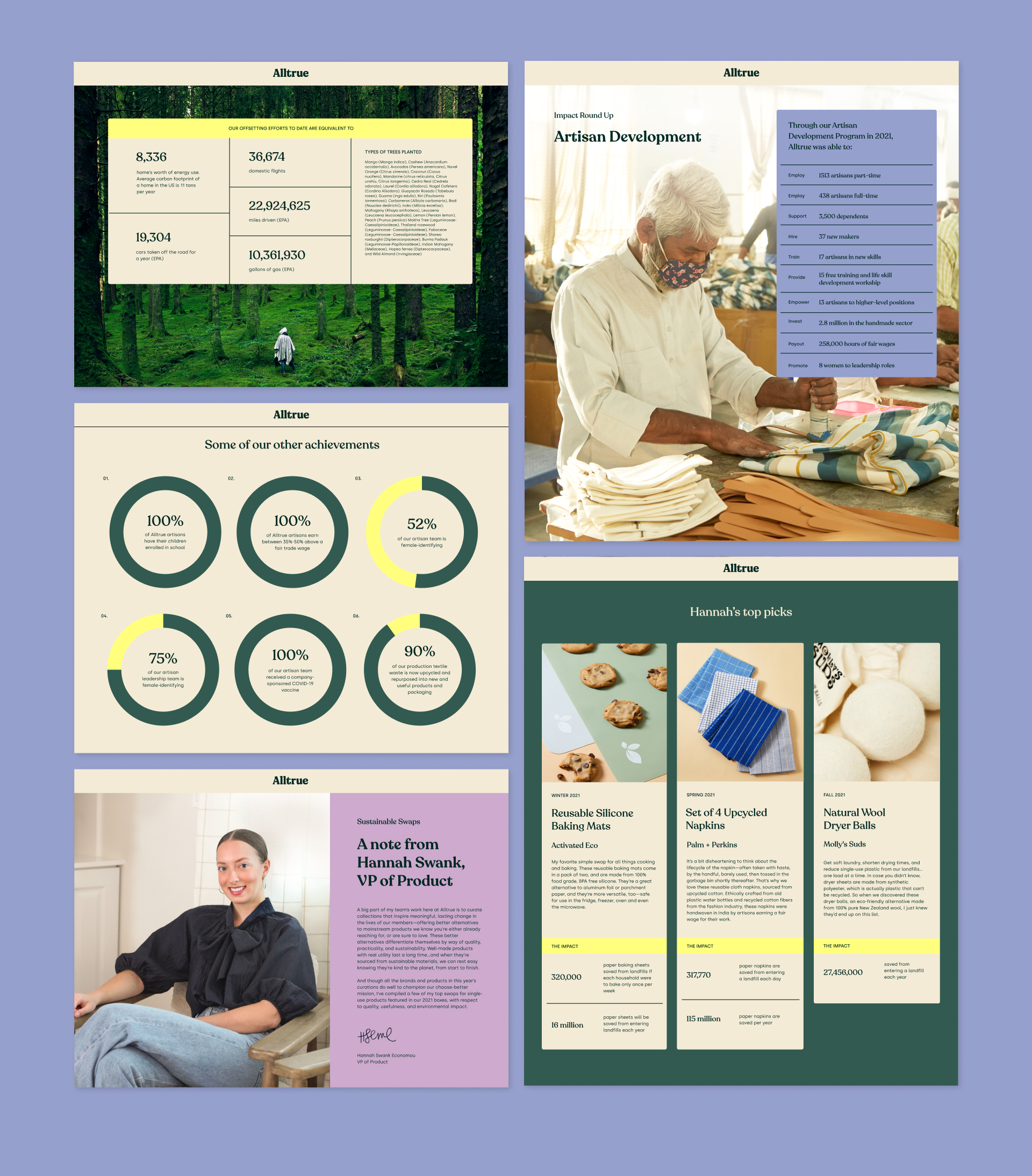
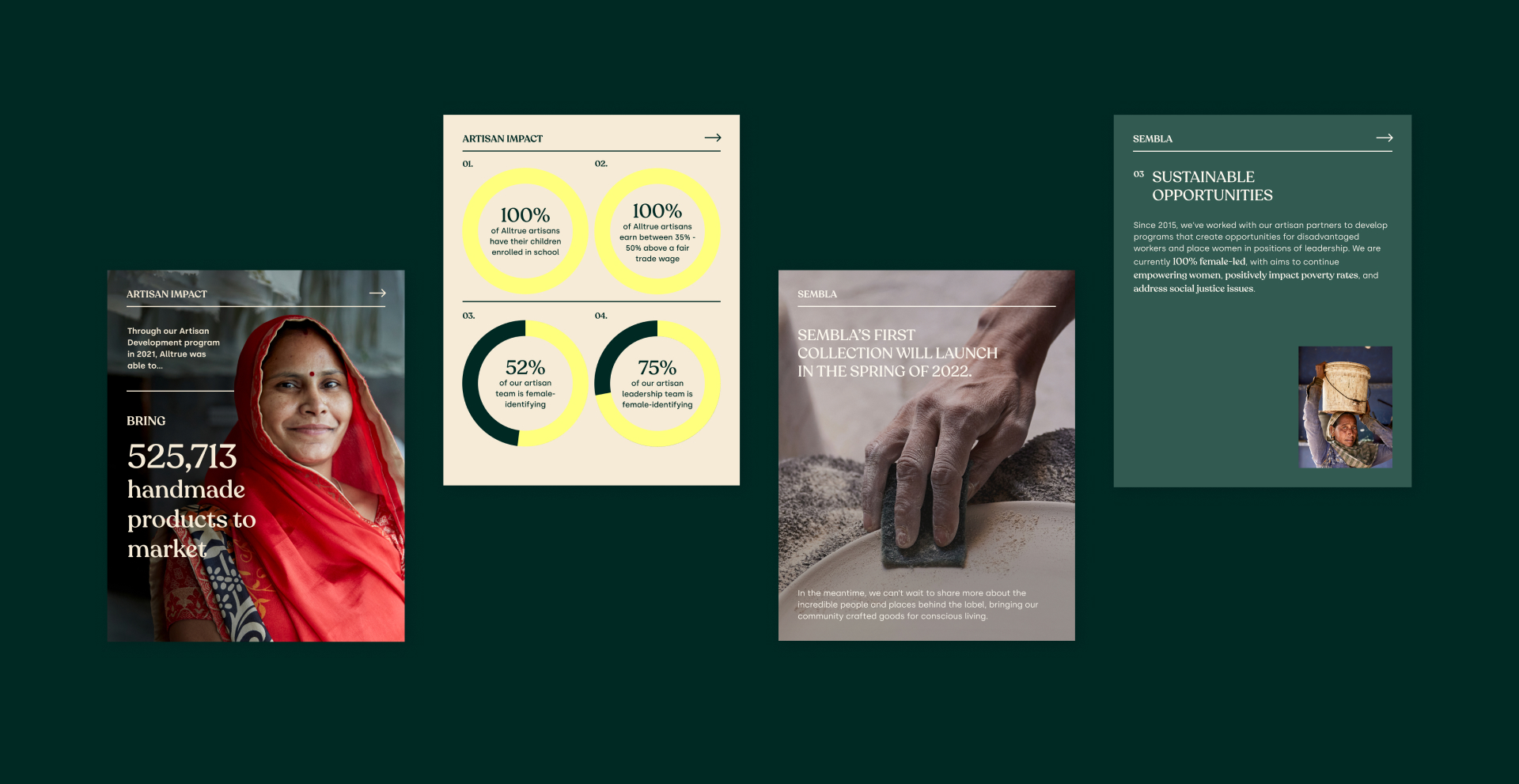
Alltrue is a subscription company that is building a membership with a heart—a place to discover brands that are committed to delivering delightful goods that are made fairly and sustainably.
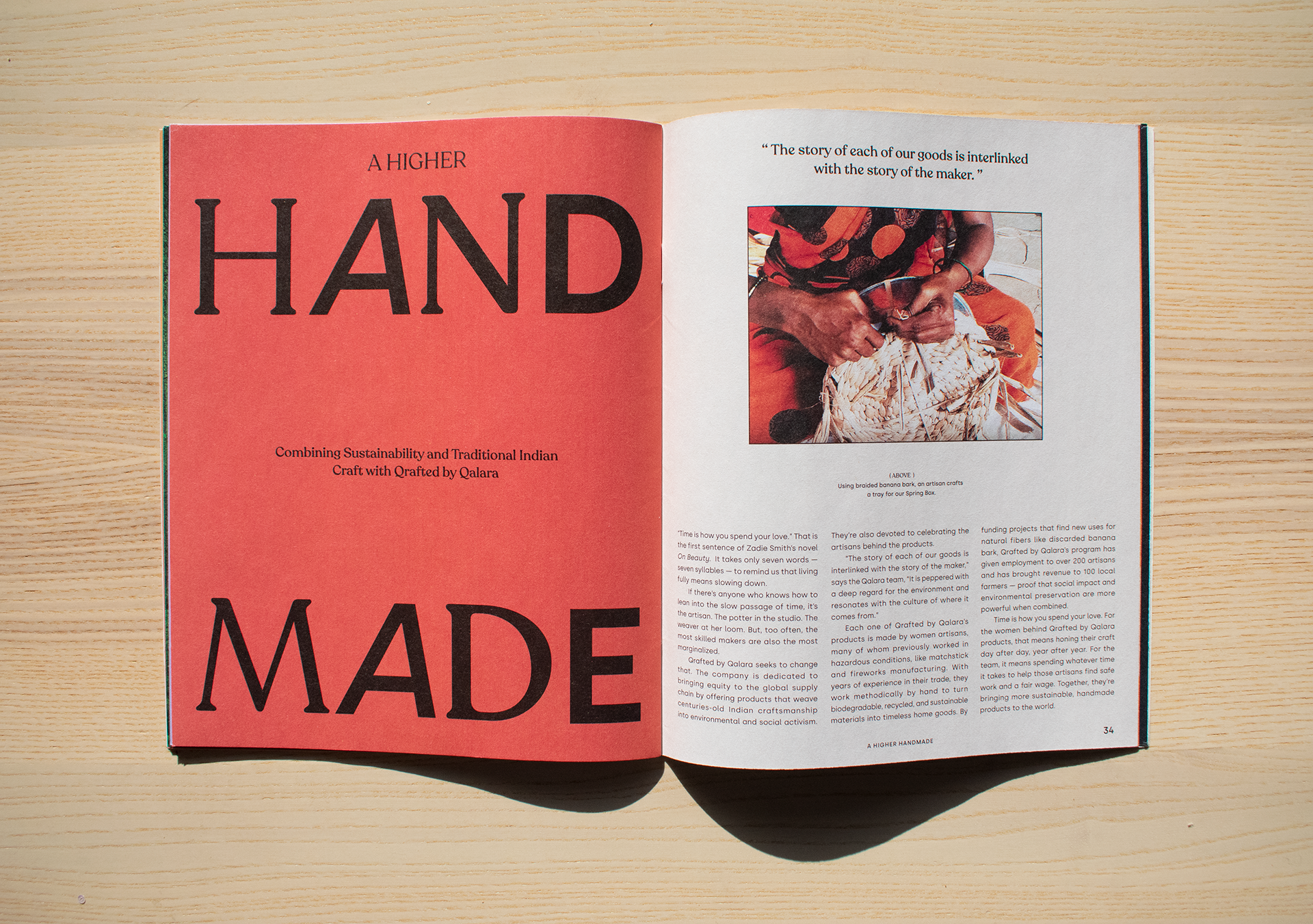
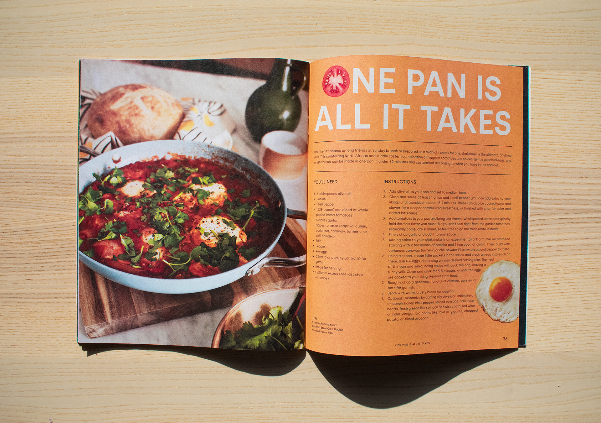
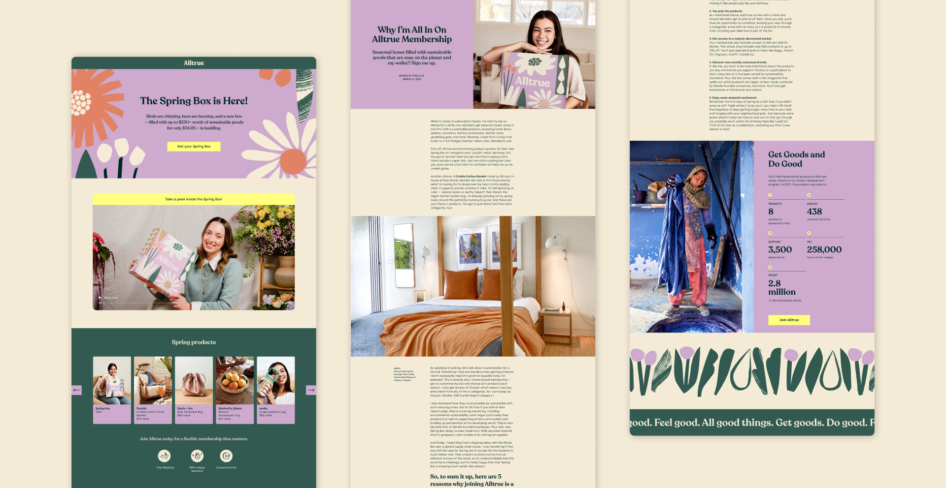
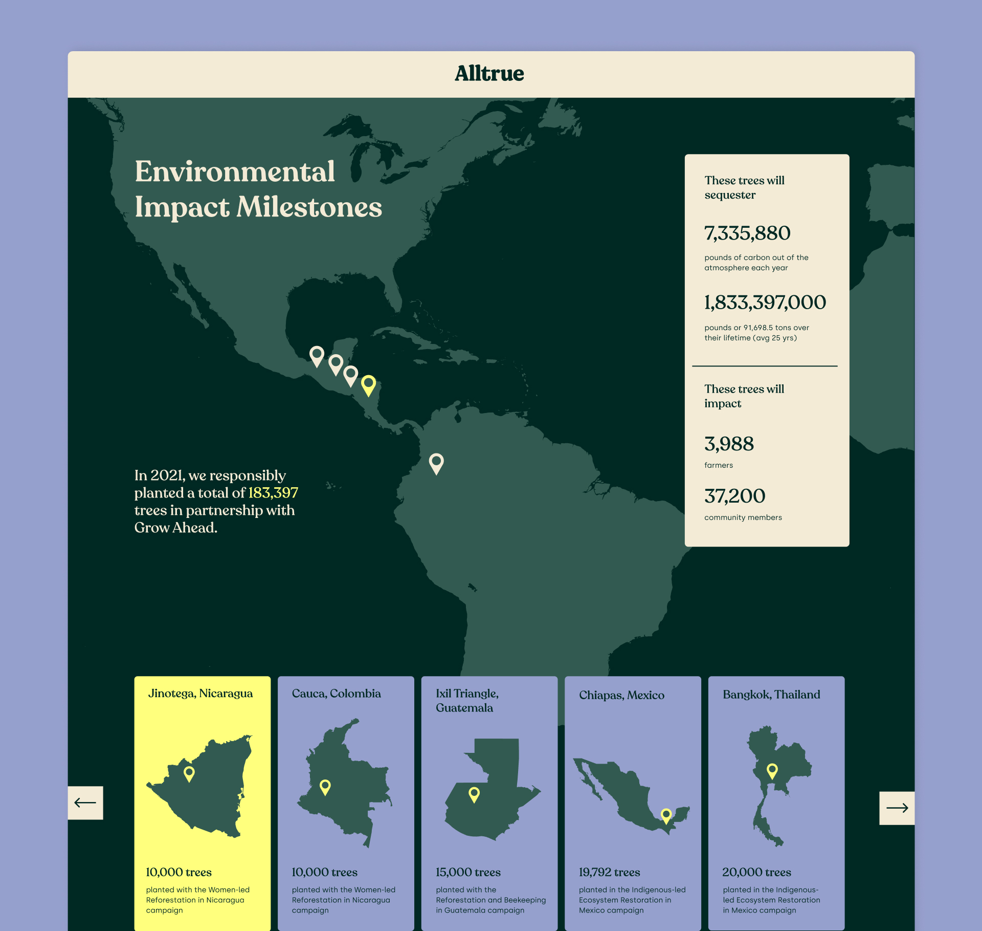
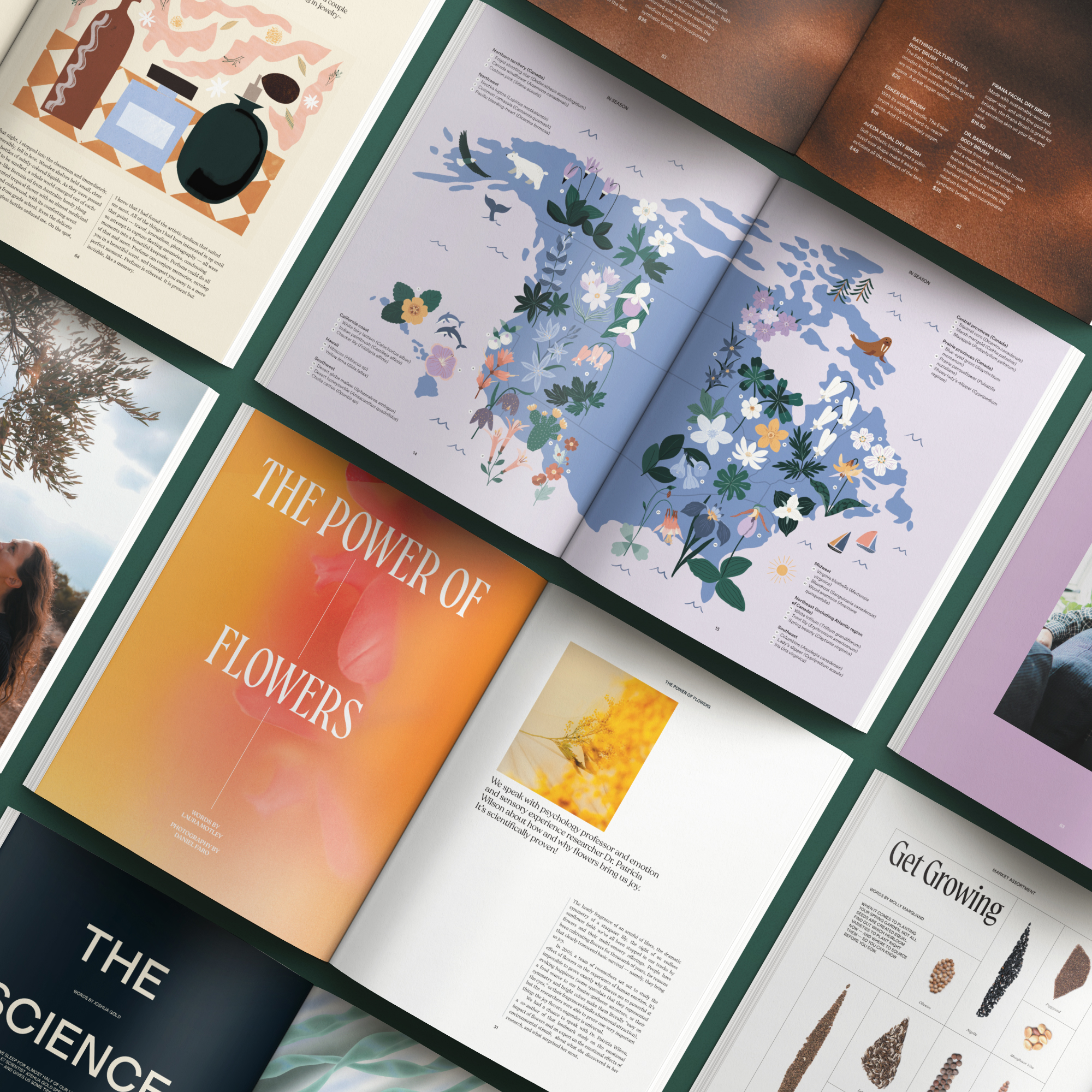
As the Senior Graphic Designer on the team, I helped shape and maintain Alltrue’s brand expression across print and digital marketing collateral.







Team
Salpy Talian
Katie Wright
Natalie Westerholt
Katie Wright
Natalie Westerholt